EarthPup
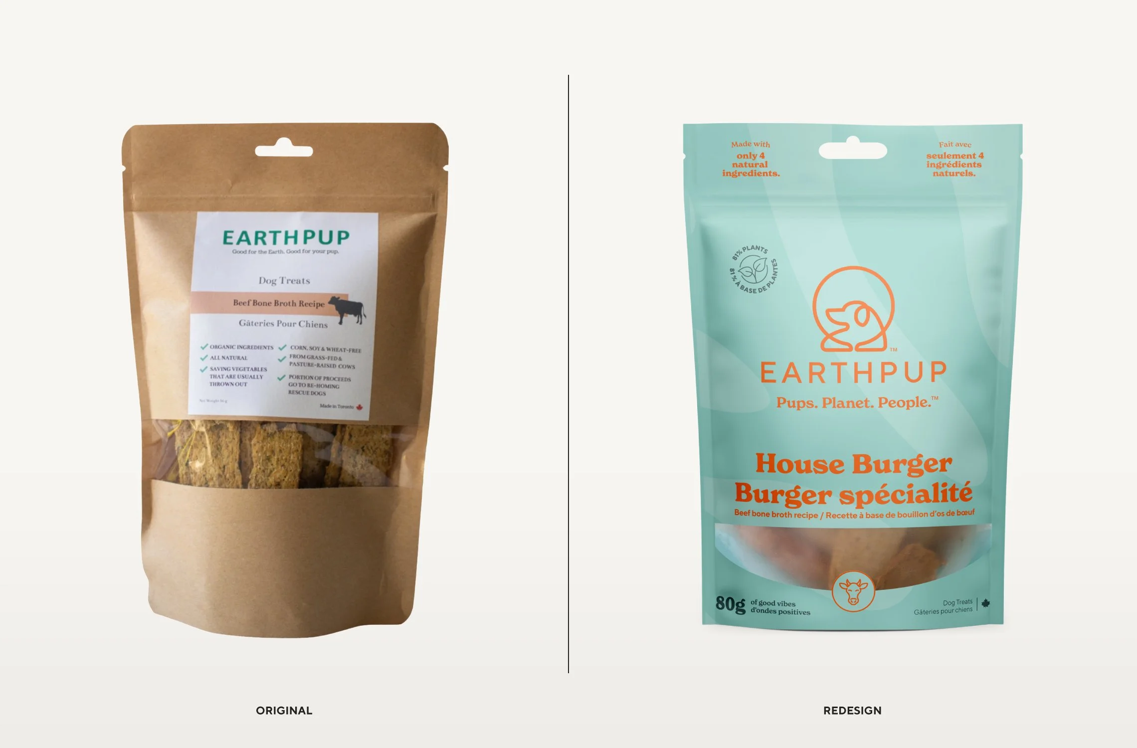
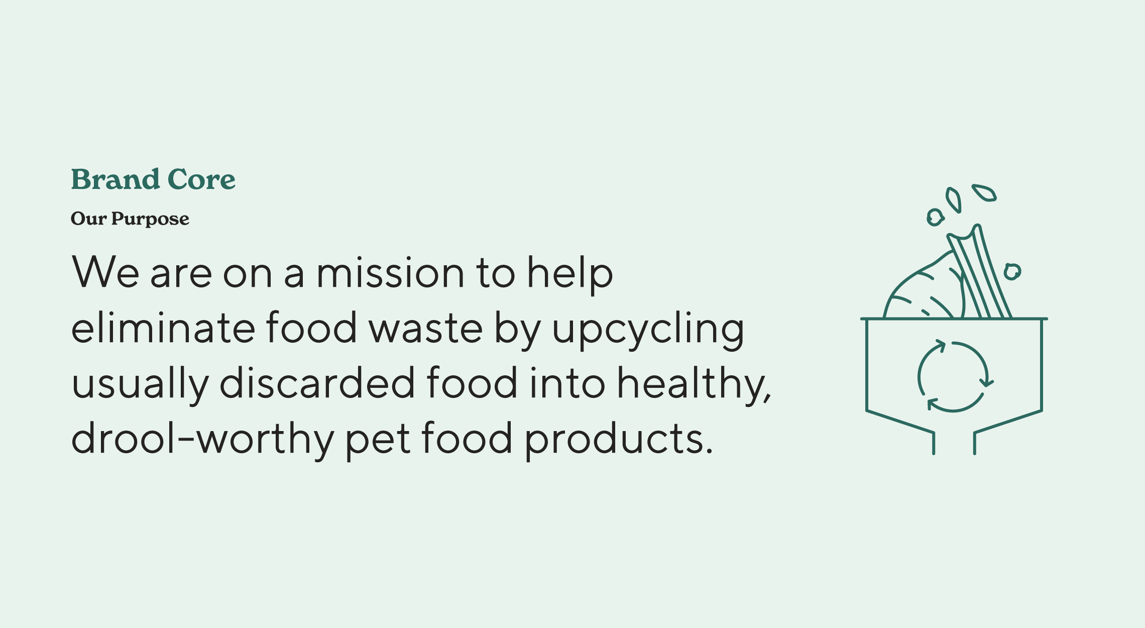
EarthPup was already selling their eco-conscious dog treats in several retail locations and online, but needed to take their entry-level packaging to the next level to scale their business. The founder Lucy is an award-winning environmentalist and sustainability expert, and her partner Adam is an acclaimed Toronto chef. It was clear they had the expertise to make this work!
We kicked off the project with a strategy and positioning session to nail down their brand direction, focus the messaging, establish their tone, develop customer personas, and more. The copywriting for the packaging was crafted, unique differentiation points were highlighted, and everything was topped with some humour and personality.
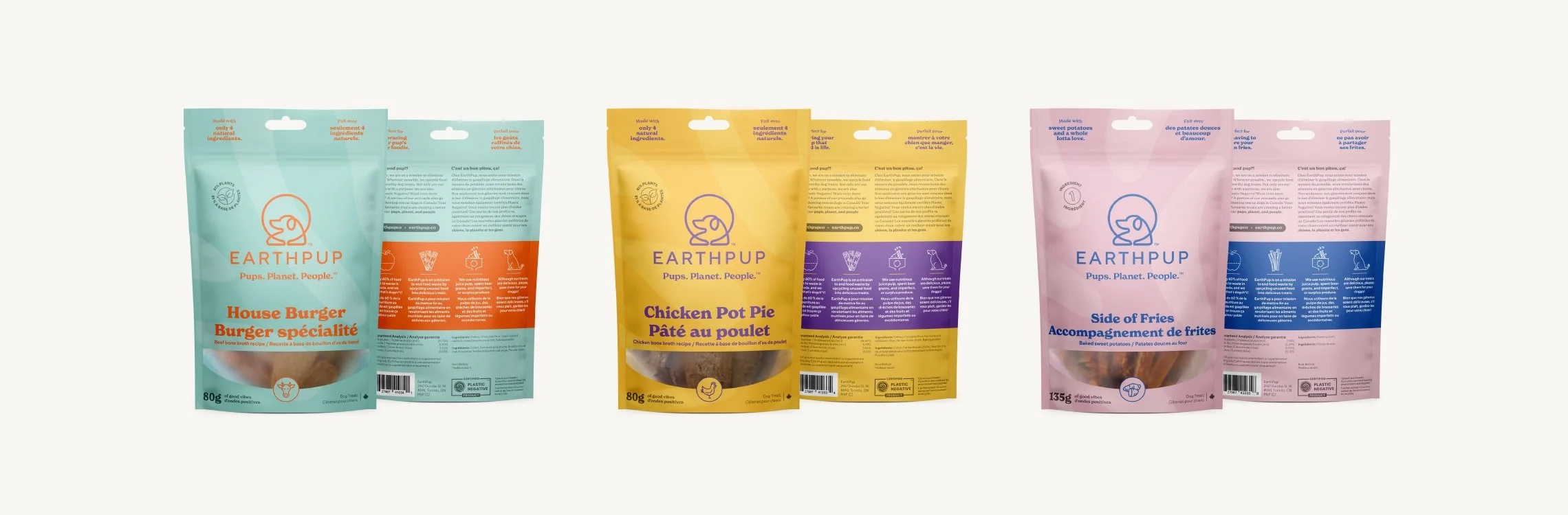
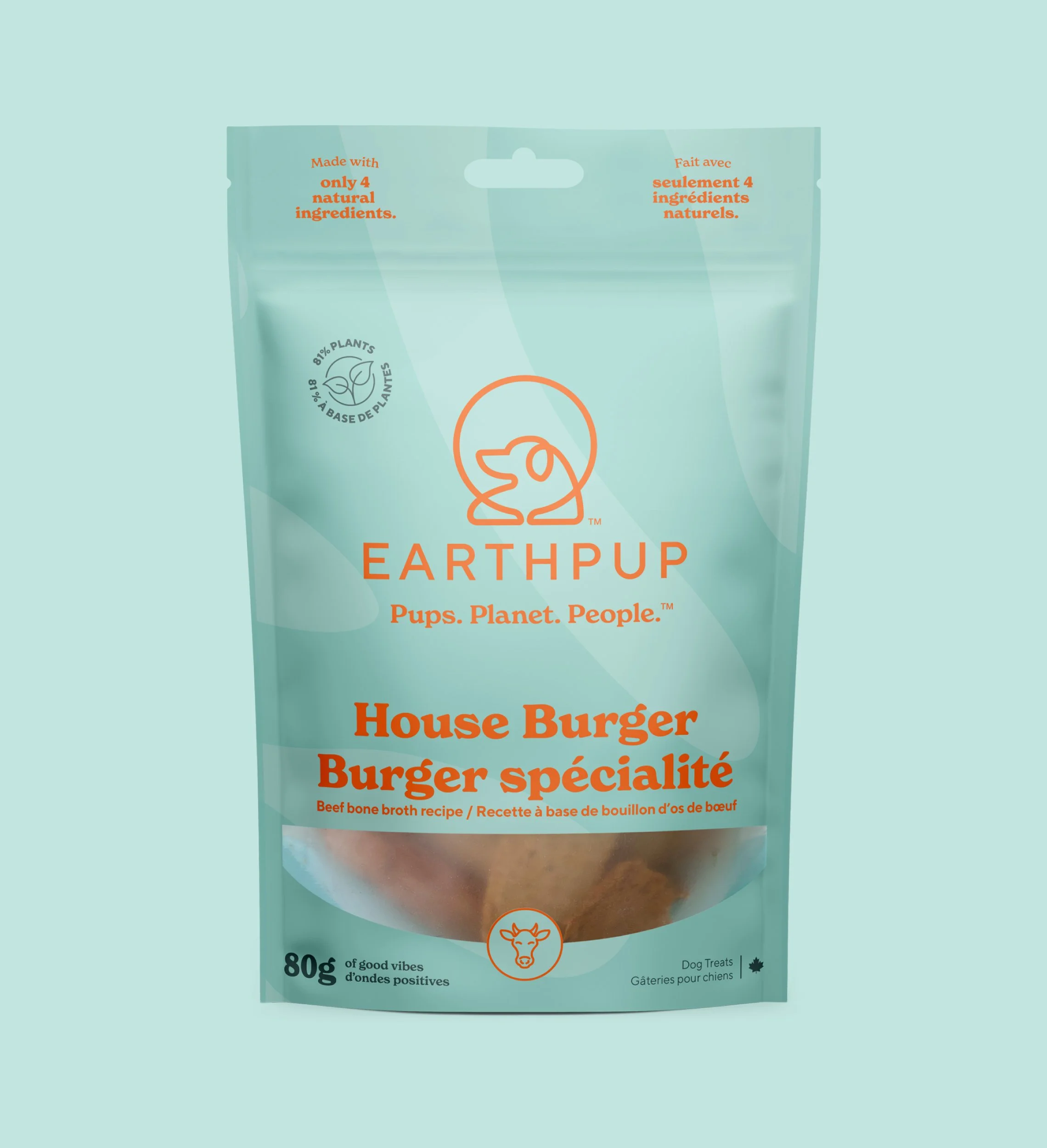
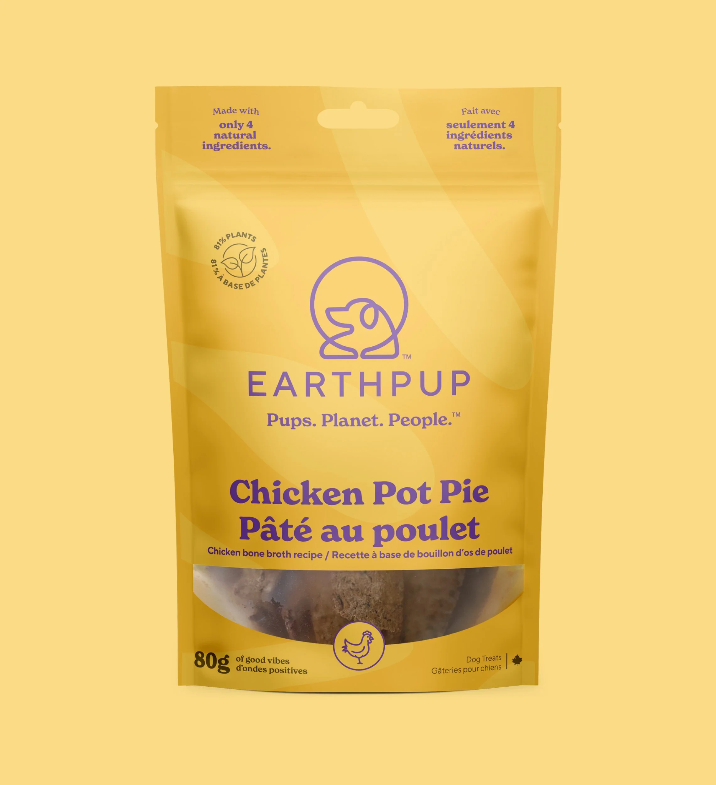
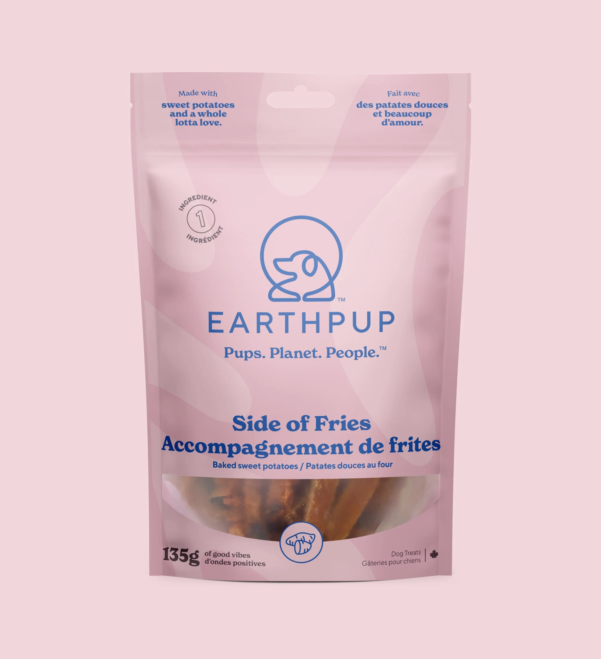
The packaging was designed around the brand’s personality which is eco-focused, playful, and laid back. Each of the flavours is named like a menu item, which creates a fun way for customers to pair treats like “House Burger” with “Side of Fries”. This also serves as a nod to the founders’ time spent in the restaurant industry together.
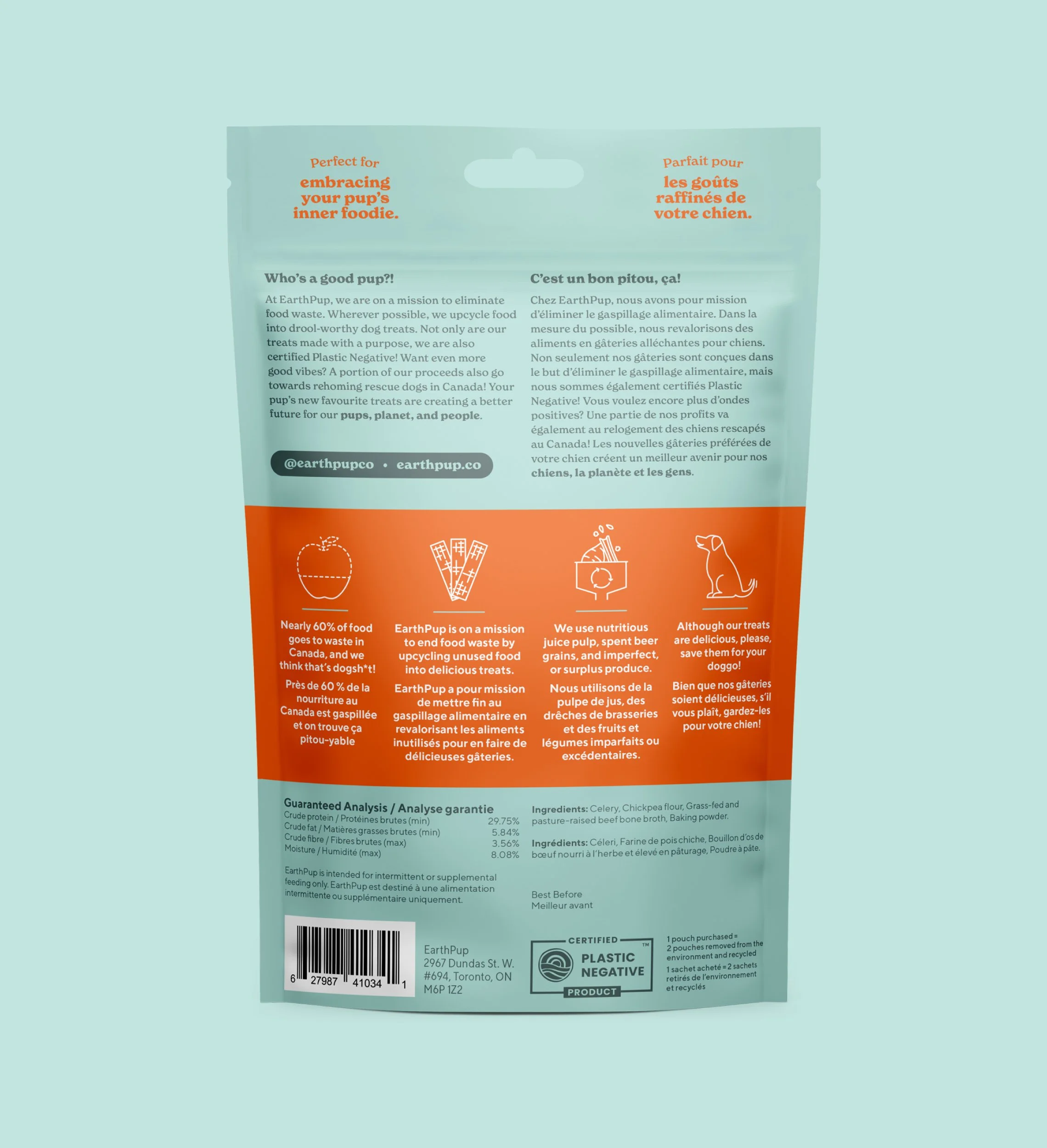
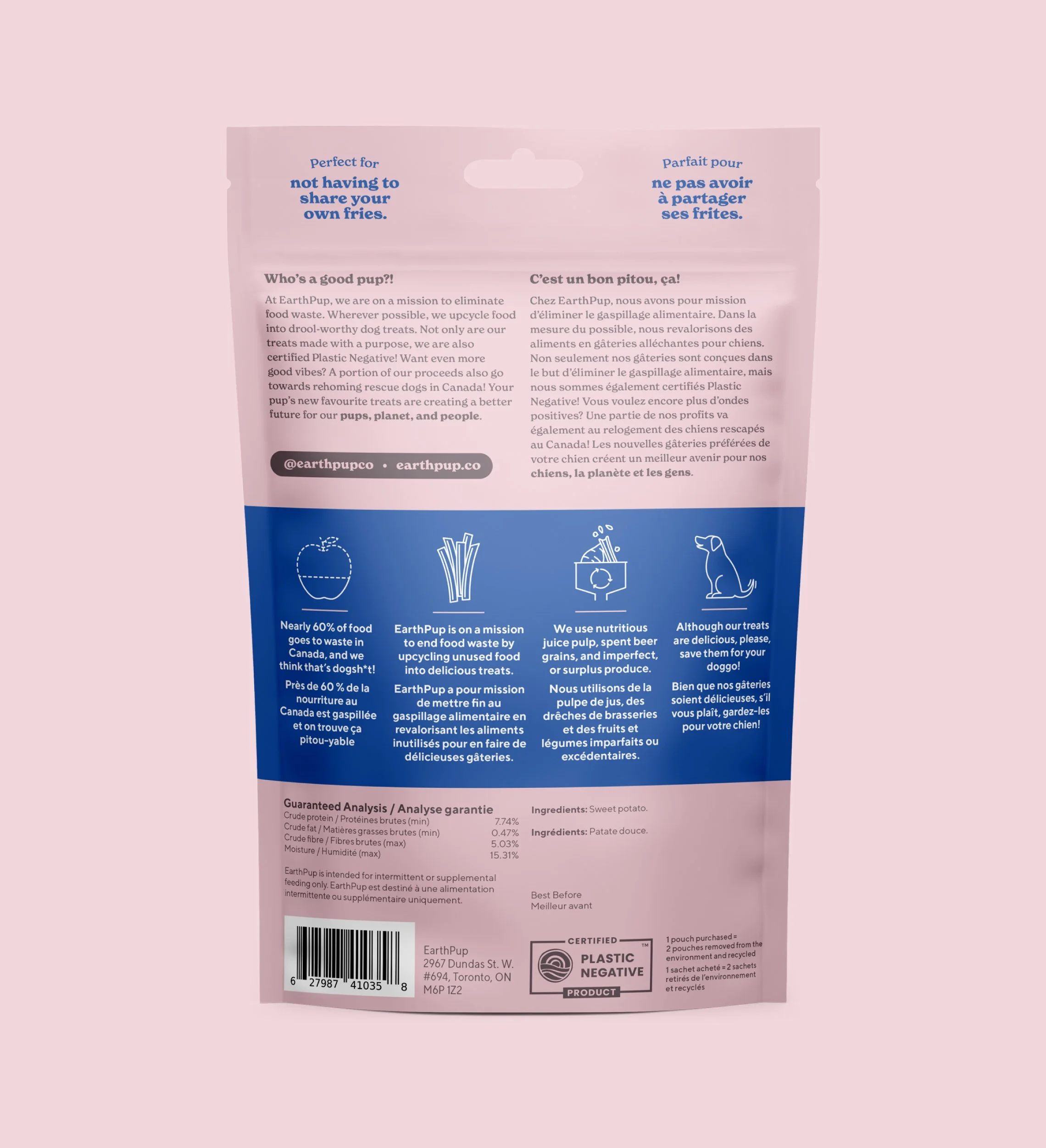
The pouch colours combine a slightly vintage, muted quality which is offset with a bold, bright accent colour. The accent colours are used to pull focus to specific details on the front, and offers separation and a space to feature the brand’s story on the back of the pouch.
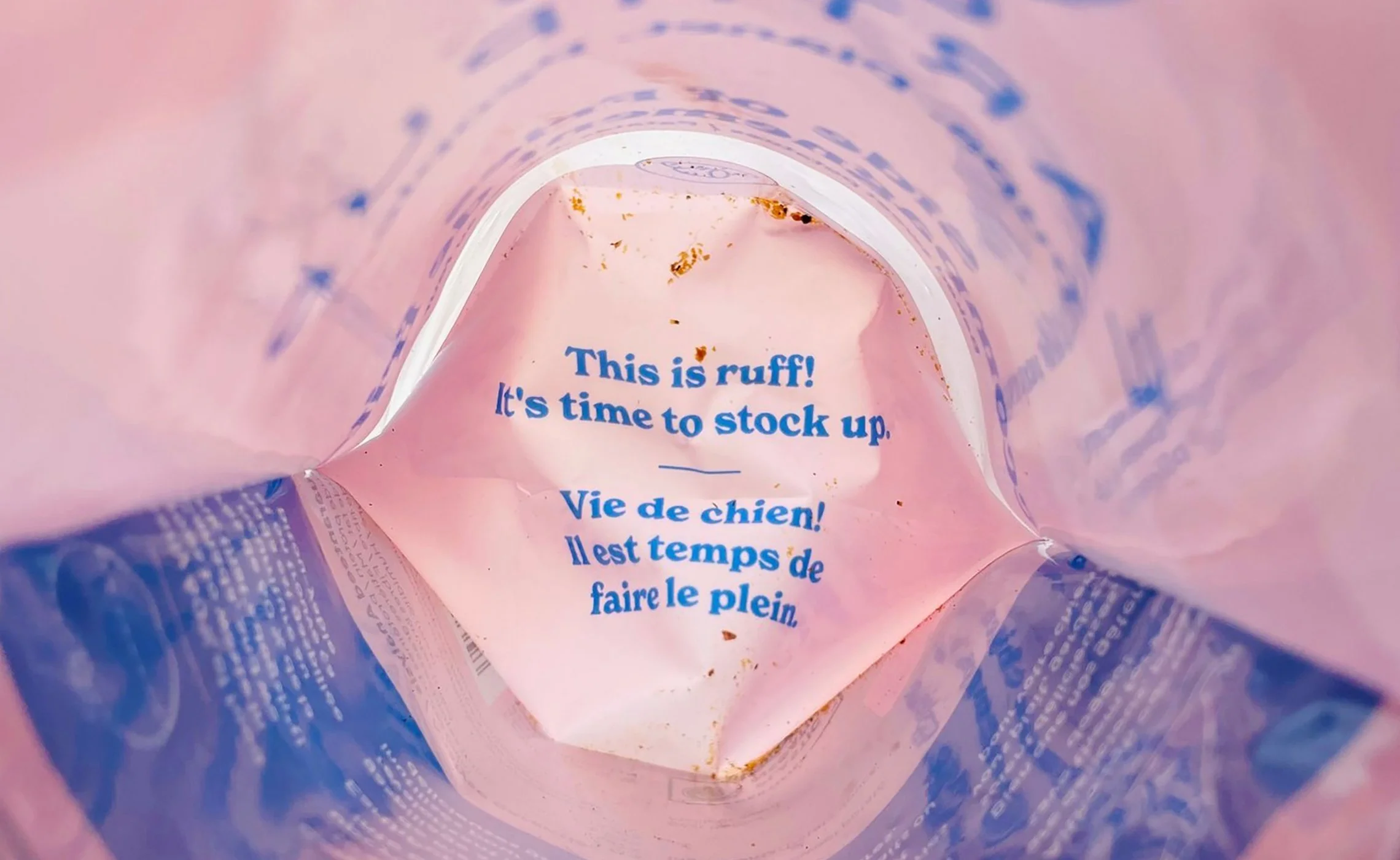
Various elements were thoughtfully added to inject personality. Icons were used to help highlight important details while clever copywriting is used throughout like “Perfect for showing your pup that food is life.” as a way to tell the customer why they should consider purchasing this treat for their pup, or the message you can only see from inside when the pouch is empty, “This is ruff! It’s time to stock up.”. Even the window to show the product is shaped to mimic a big, wide smile!
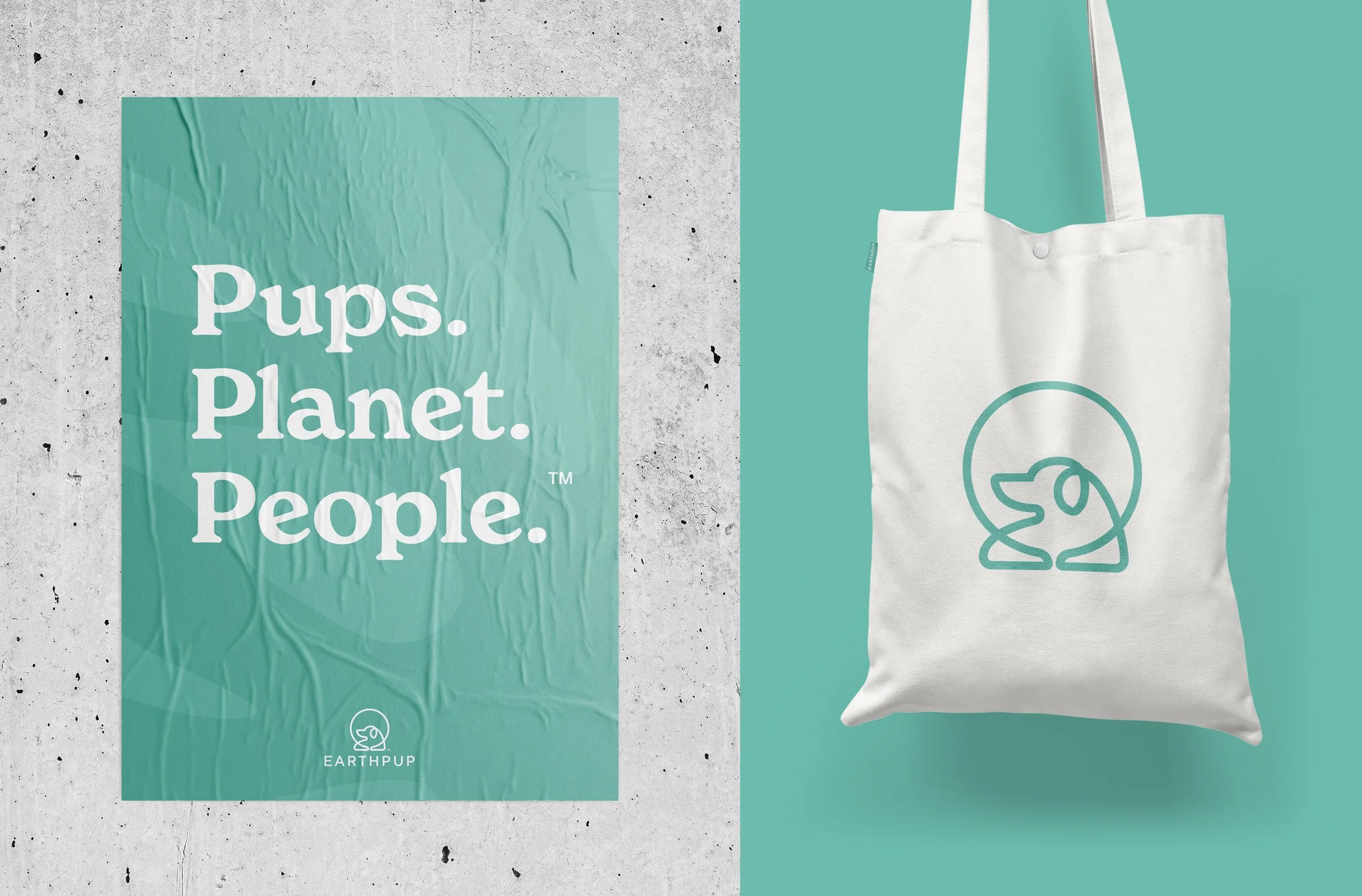
Although EarthPup already had an existing logo, I was able to refine some of the details that were lacking. With that, an updated and warmer brand colour palette was established along with all new typography which further leaned into the slightly vintage vibe.


This project is featured on:

“I wish I could always be working on a project with Brett. He took our ideas to have a fun brand that pushes the envelope, and brought them to life. Not only did we love the entire project process, and designs Brett came up with. But we also really appreciated how Brett truly became part of team. Sharing the wins with us, being patient and supportive when there were setbacks. I can’t imagine ever working with someone else. We are unbelievably proud of the brand now. Before, retailers weren’t interested in listing us because of our packaging. And now it’s the #1 compliment we get all the time about our products! A franchise that previously delisted us, brought us back on because of the packaging. The new designs from Brett have turned our business around. Before, our packaging was an eye sore and now retailers can’t wait to show off the gorgeous packaging.”