Voyce CBD
I was brought on by the team at Voyce to establish their brand identity and help with their minimalist packaging. Voyce is a company who cares deeply about health, wellness and thriving. Obsessing over nutrition, exercise, and the products people ingest in their bodies. Using a sustainable and environmentally-friendly processes to create a CBD product that is 100% pure, scientifically-proven, and affordable.
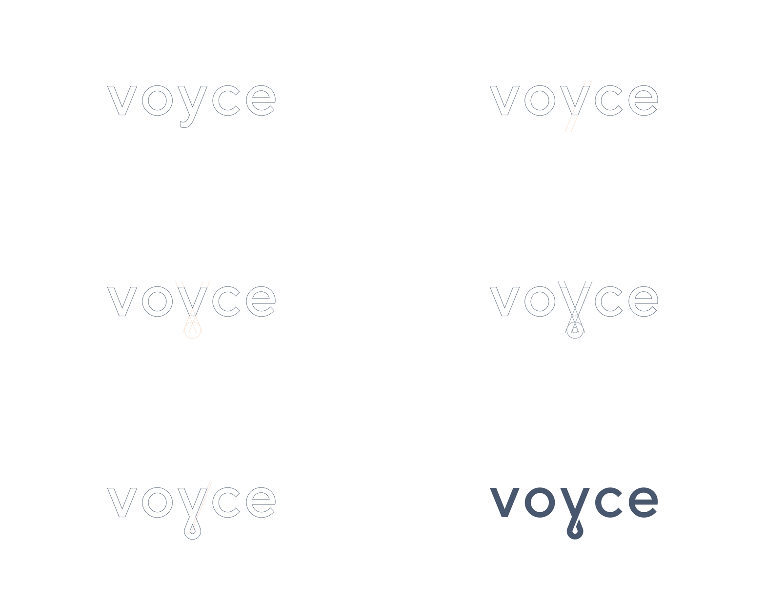
Voyce already created distinction by using a ‘y’ in their name, so I wanted to build on that direction. The ‘y’ was stripped down and modified to create a looped ‘y’. While giving a sense of balance to the identity, it also created a subtle oil droplet in the negative space as a nod to their CBD oil. The geometric sans serif typeface selected for their premium brand is paired with a colour palette that balances personality and professionalism.
Product photography provided by Voyce.


