
Chew Chew Treats
Chew Chew Treats is an all-natural dog treat company based out of Toronto, Canada. They had already a logo they were using, had established a solid following and customer base in the Toronto area, but came to me to give their brand an overhaul and to help them grow the business. As we discussed their business, something they said immediately jumped out at me and ultimately became the foundation of the rebrand.
“We believe that treats are much more than just training rewards. They are also a gesture of love…”
This was such a strong statement, and as someone with two dogs, I completely understood how true it is. We had our direction. Happiness. Fun. Love.
The new identity combines the initials CCT to create a happy dog’s face. This is paired with a dog bone with hearts on each end to further tie in with the “gesture of love” direction.
For the packaging, I created a design system that would work for their 6 flagship flavours and beyond, helping them make a statement both individually and on the shelves as a group.
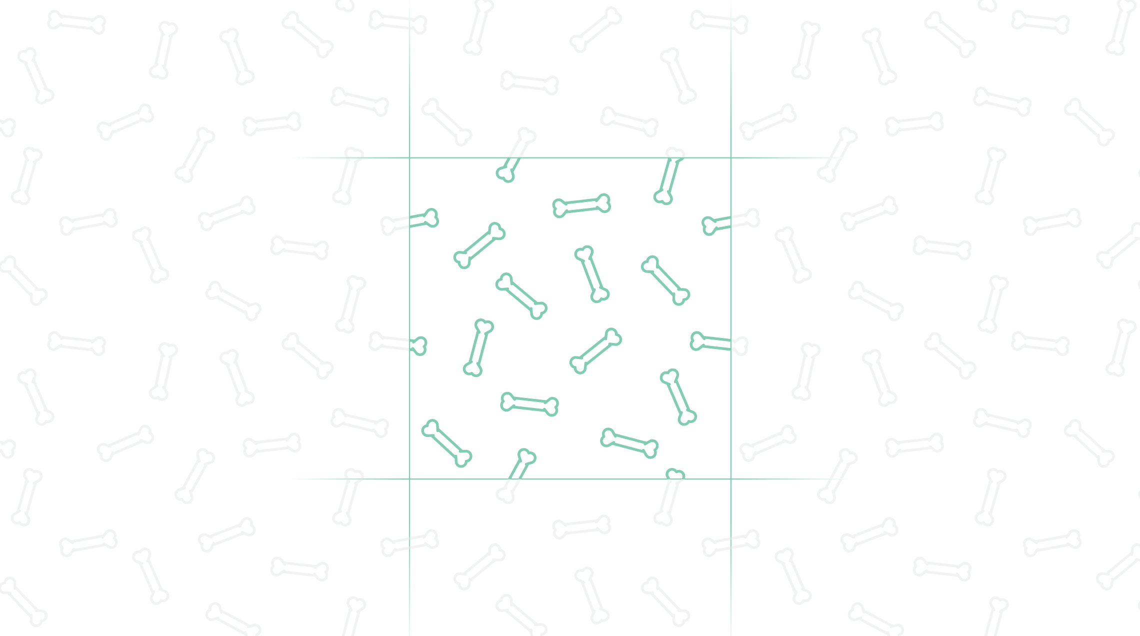
The tongue-like element adds colour and balance to the clean, white packaging and directs the eye towards fun and simple flavour illustrations. The bone pattern is carried from the front to the back where the brand’s story is featured.


This project is featured on:


“Working with Brett has been an amazing experience. We started off as a local business (attending farmers markets and small shows) and found it difficult to introduce our products outside of the community. Brett helped us to create a visual identity and new packaging that helped convey our values and story in a much simpler way for new customers to understand. We are now confident that these changes will help us become much more competitive in the retail space and at large trade shows!”