






Iron Road Brewing
Honouring local history while pulling in a new generation of beer lovers
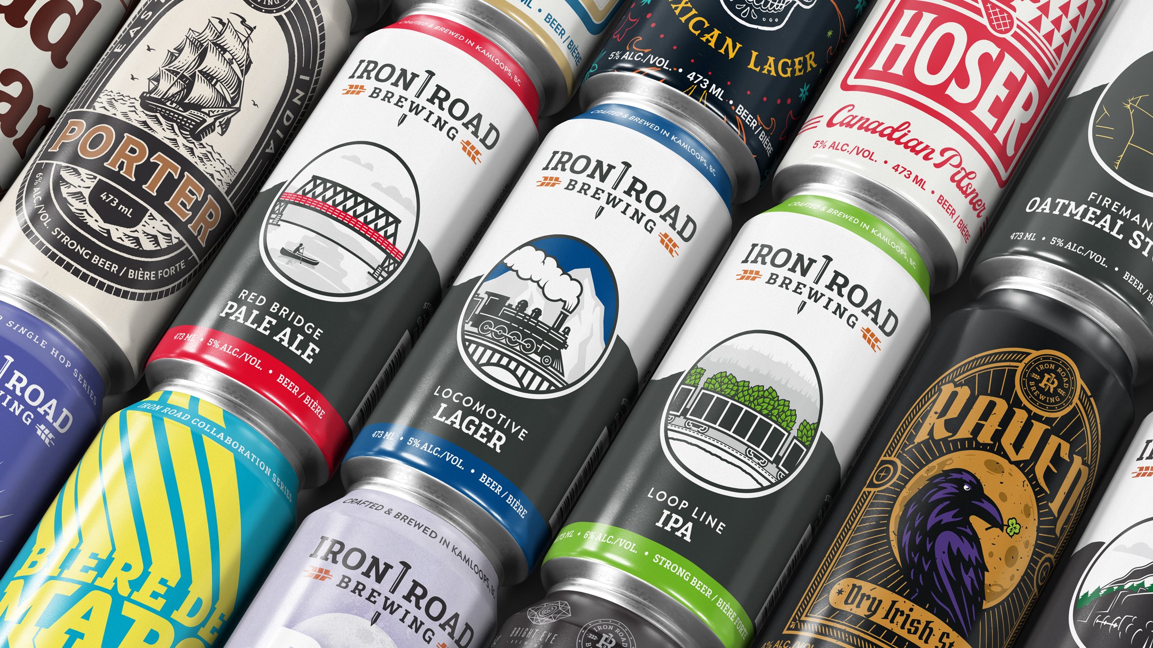
Iron Road Brewing had a couple unsuccessful attempts to get their brand right before coming to me. They needed an identity that could do two things. Earn credibility with Kamloops locals who take pride in the city's railroad heritage, and pull in the younger crowd living right on their doorstep at Thompson Rivers University.
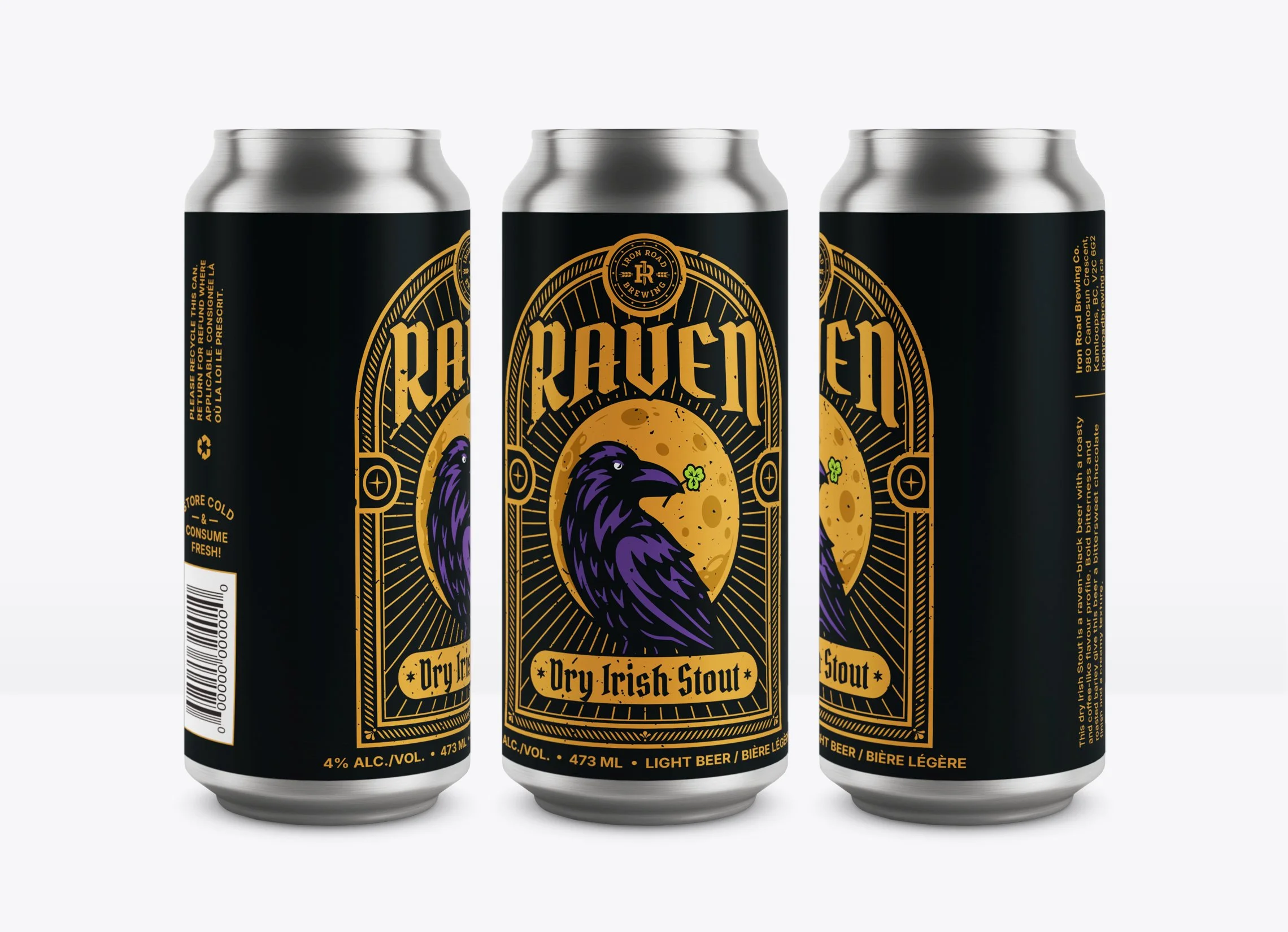
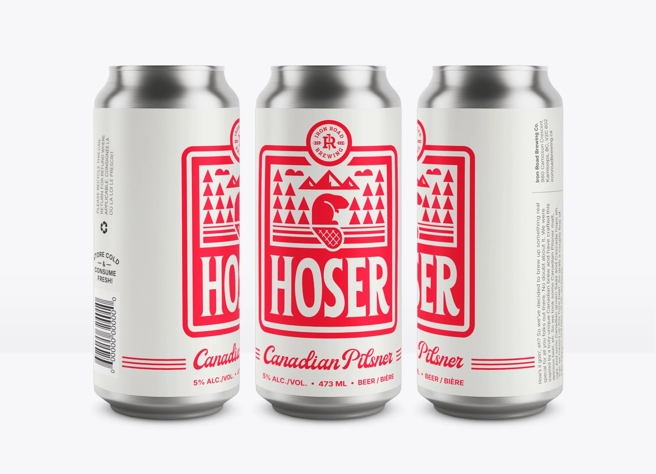
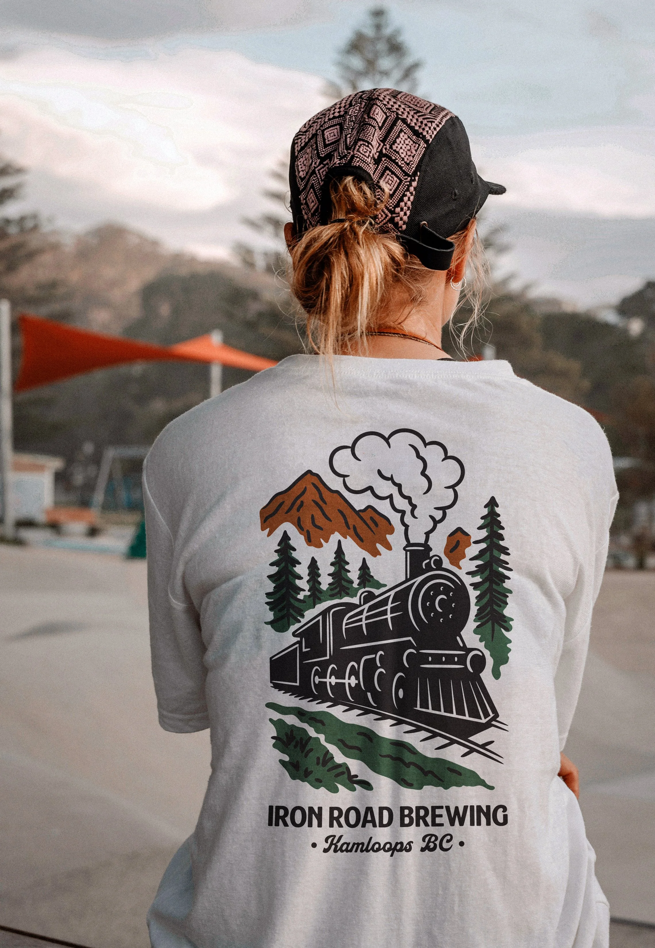
The result brings everything together with clarity and purpose. A heavy slab-serif and a palette of dark charcoal and rusty orange (iron and rust) give the brand an unmistakably industrial character that feels relatable to locals. An iron spike separates the wordmark, doubling as a standalone icon and anchoring an alternate "IR" mark surrounded by details drawn from the front of an old steam locomotive. The identity stretches naturally across packaging, merchandise, and stationery, projecting the kind of strong, welcoming image that works just as well on a can as it does inside the taproom.
Photography: Iron Road Brewing
“Brett goes above and beyond while working on our brand’s designs, and delivers a final product that we’re very happy with. He works very quickly and meets all deadlines, keeping us in the loop during the whole process.”