
RIP Cold Brew
Evolving a CPG brand into a cohesive, scaleable product suite
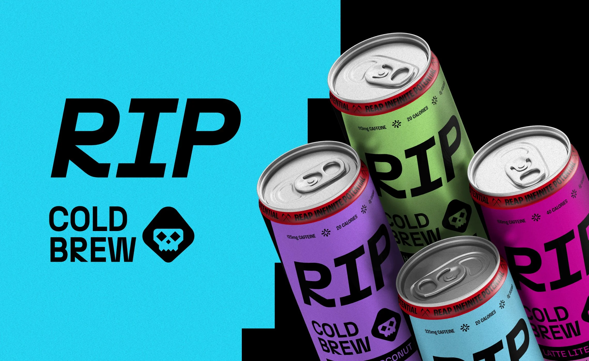
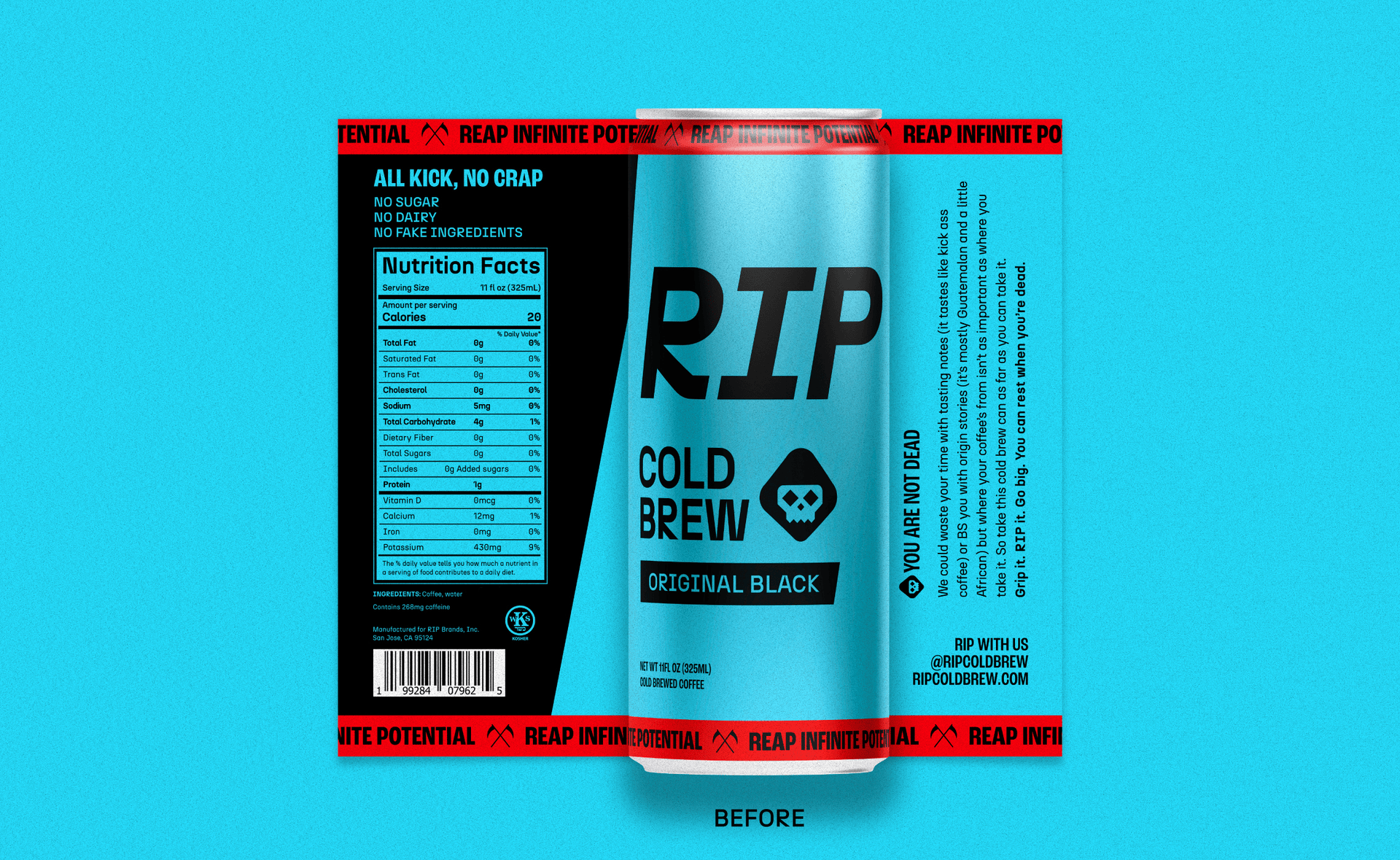
RIP Cold Brew came to me with an outstanding brand, which isn’t typically how a project starts. The original branding and packaging, designed by MHD, is packed with personality, taking on an early 80’s skate culture aesthetic with a dose of 8-bit characteristics. The brief wasn't to start over though, it was to build on what was already working really well and evolve the packaging to support a growing lineup of cold brew SKUs across multiple product categories.
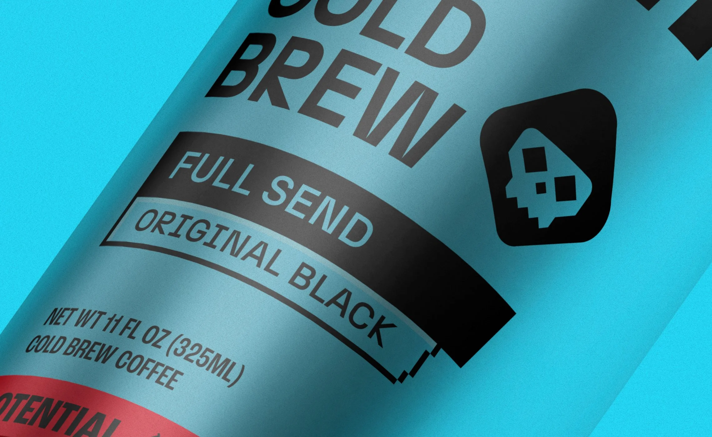
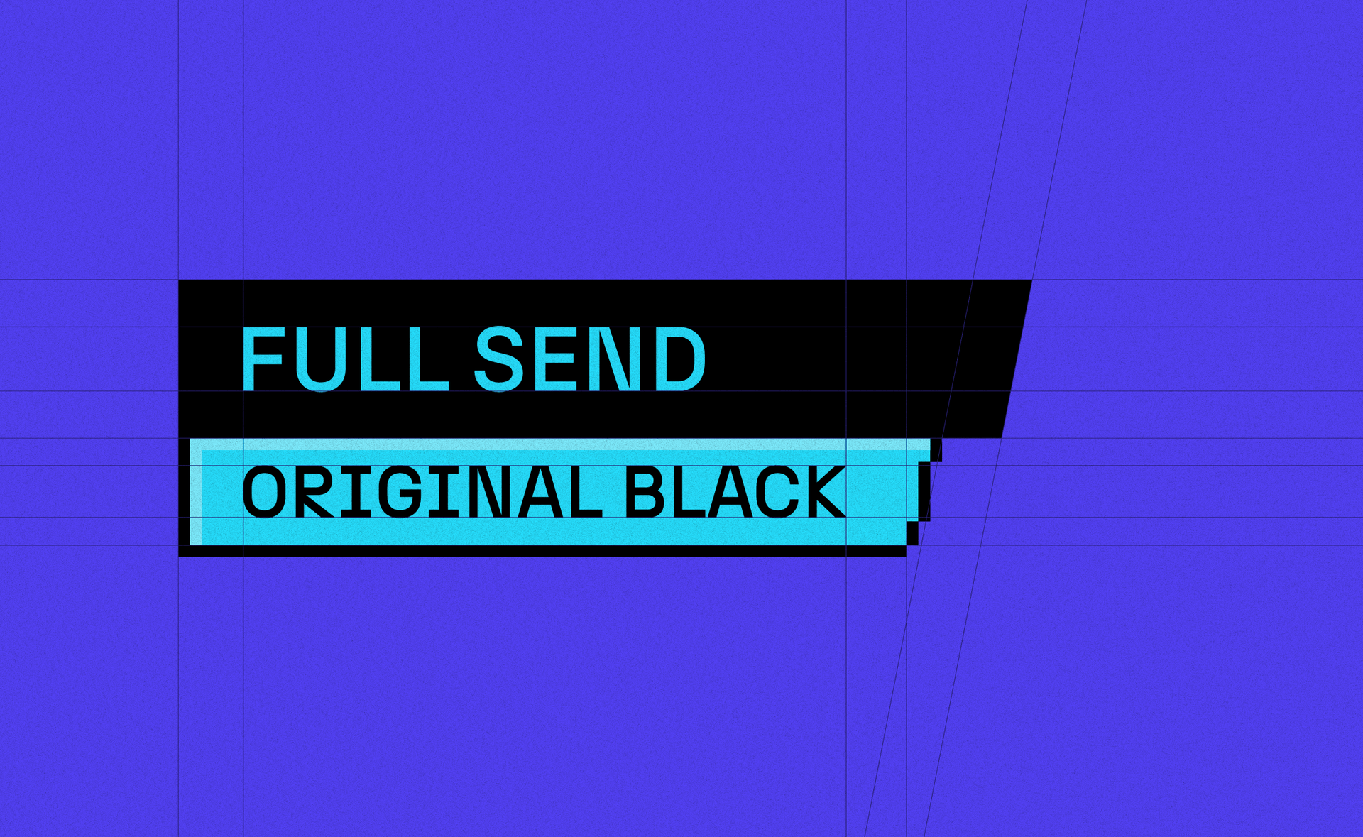
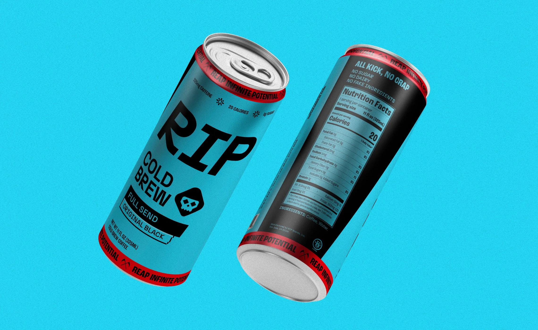
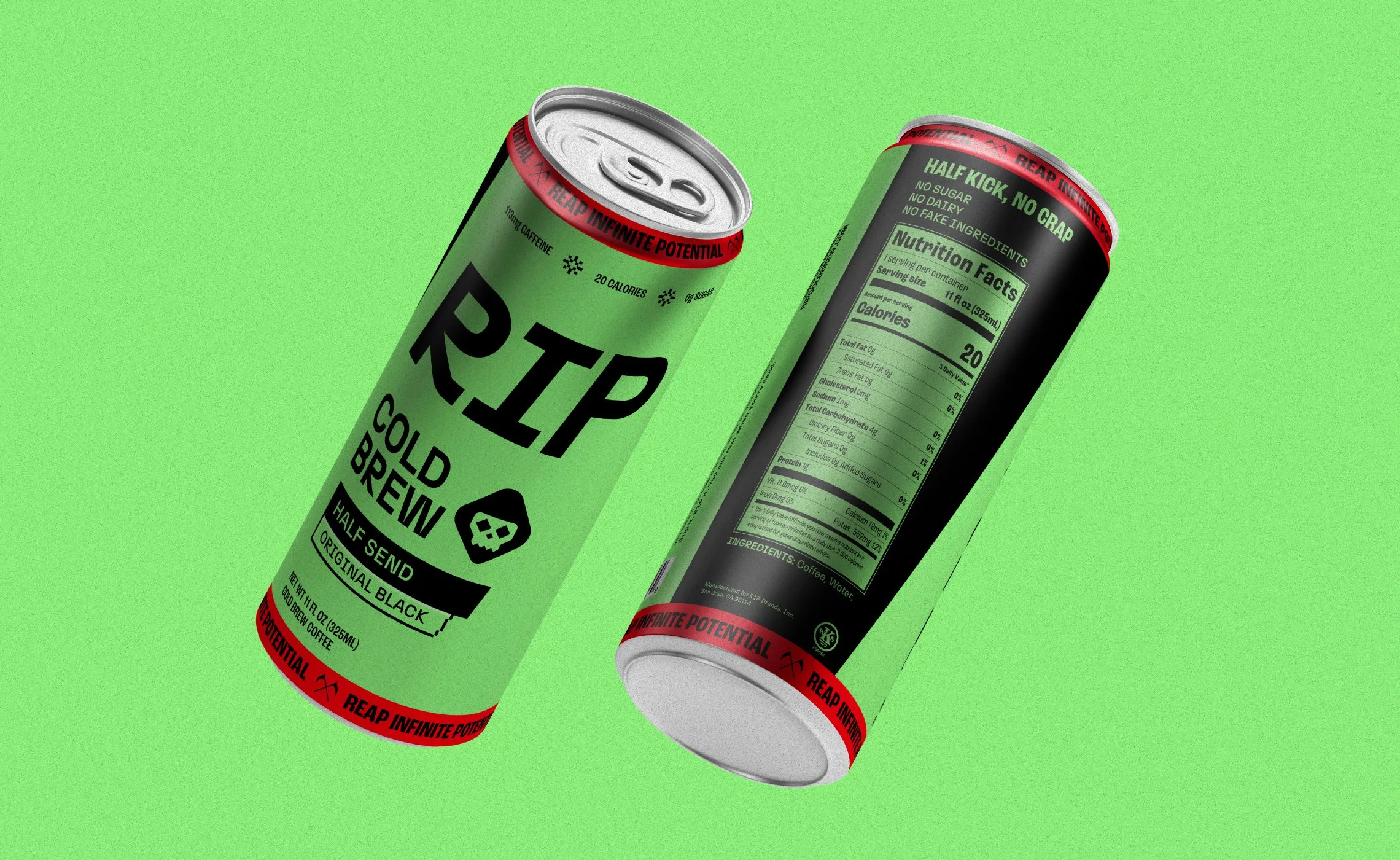
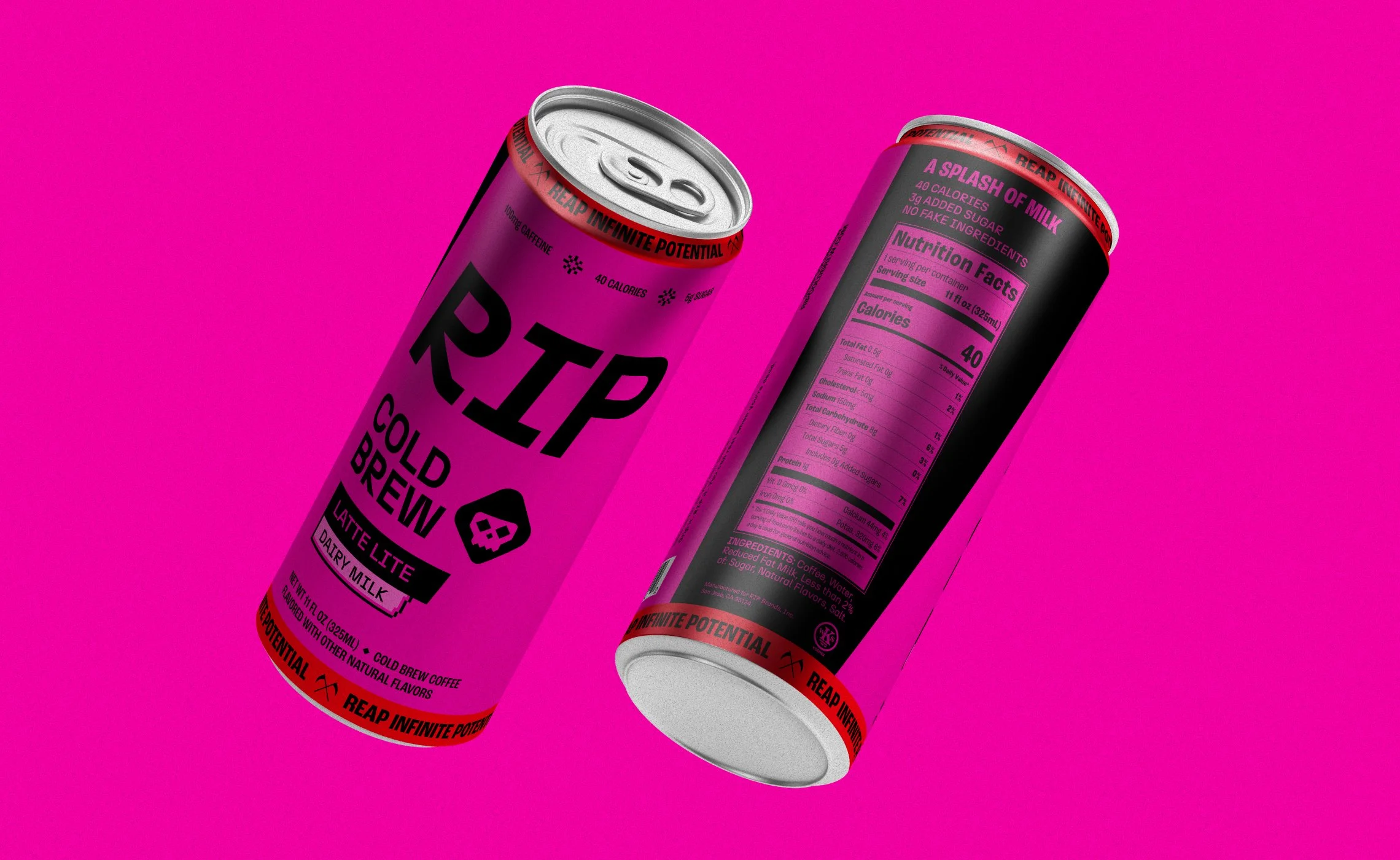
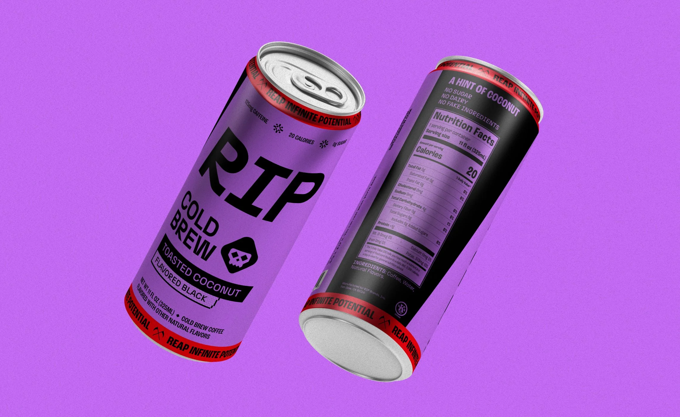
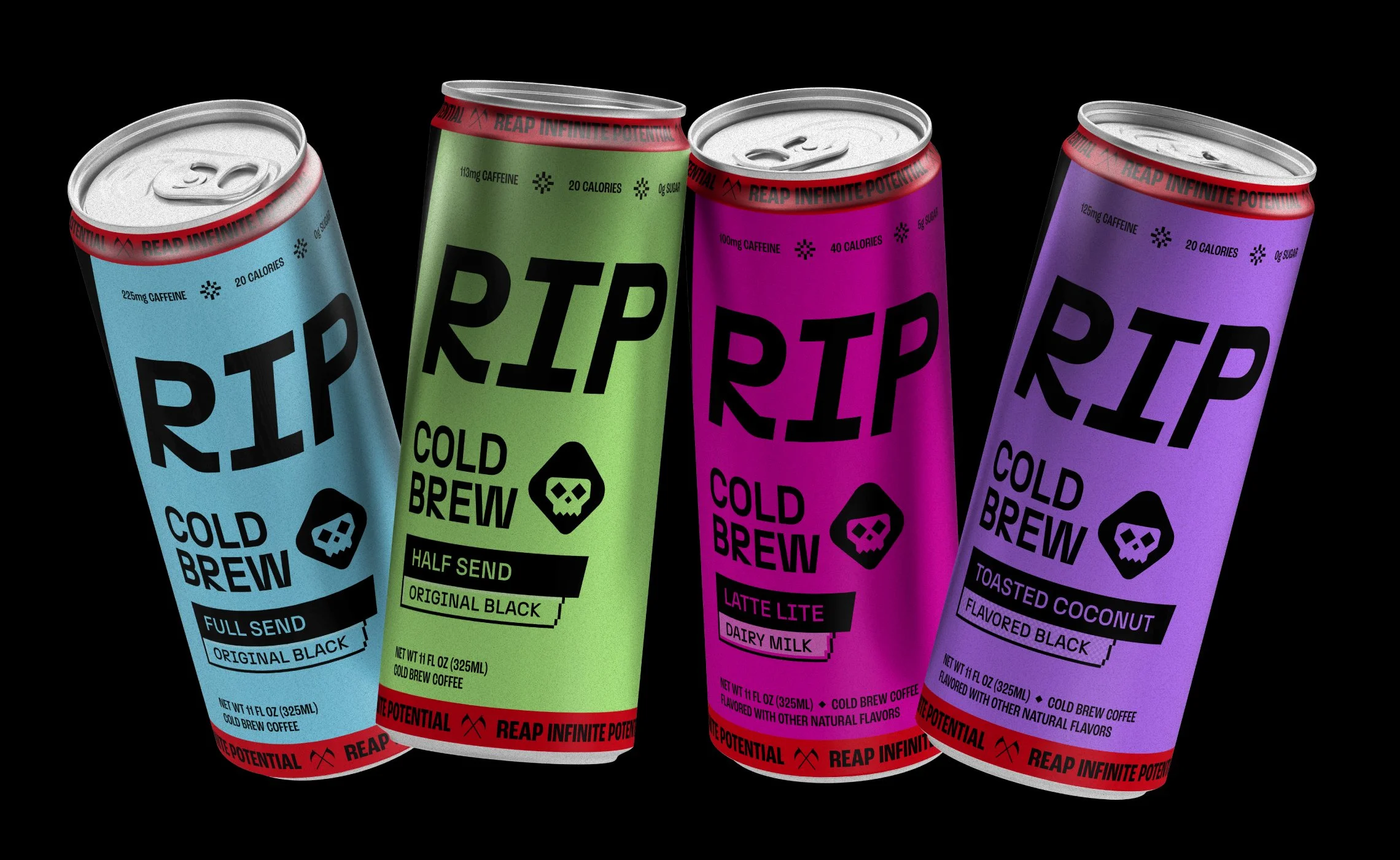
Each category (black coffee, flavoured black coffee, latte, and beyond) needed different visual cues while still coming together as a family of products. A clear hierarchy between product name and category helps customers orient quickly, with the product name always taking the lead. Category names are highlighted in an 8-bit style that sets them apart from each other, while remaining flexible enough to expand as new products are added.
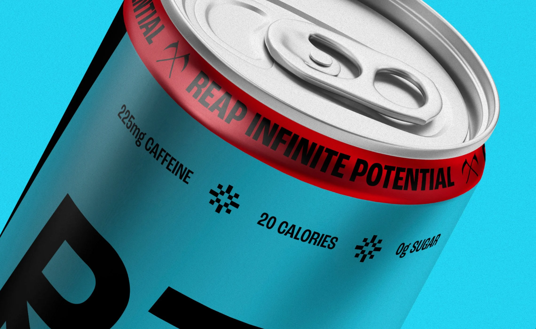
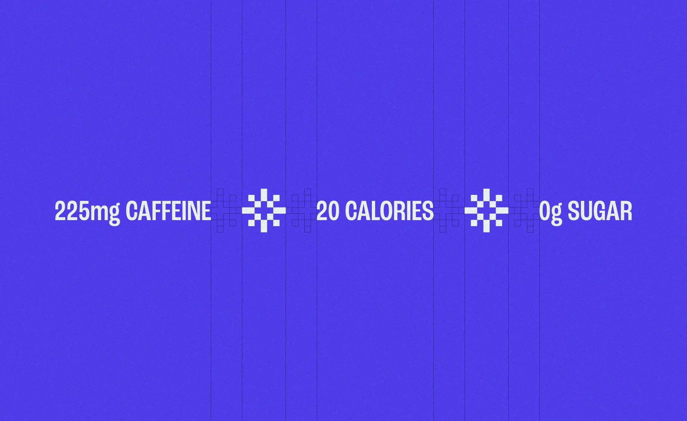
The updated visual language leans further into the subtle 8-bit and vintage extreme sports direction that makes the brand memorable, developing those details beyond decorative touches into additional ownable brand assets. Nutrition callouts for caffeine, calories, and sugar content give customers the information they want at a glance, separated by 8-bit style bursts that bring a sense of energy to the panel. An angular flow across the product name and category adds to the existing sense of movement in the layout.
The result is a packaging suite that feels like a natural evolution. Coherent, confident, and ready to RIP.
“Brett was everything we were looking for to help us evolve our original packaging into a full product suite. Detail oriented from the start, Brett was able to offer up plenty of explorations along the way that not only helped us accomplish our goals for the new SKU packaging but also helped us build on our brand in a way we haven’t seen other designers achieve.”