


Chew Chew Treats
A rebrand built around a simple truth: treats are a gesture of love
Chew Chew Treats had a loyal following and customer base. What they needed was a brand identity and packaging strong enough to help them grow beyond the local scene. Early in the conversation, they said something that reframed the whole project: "We believe treats are much more than training rewards. They are also a gesture of love." That became the foundation for everything.
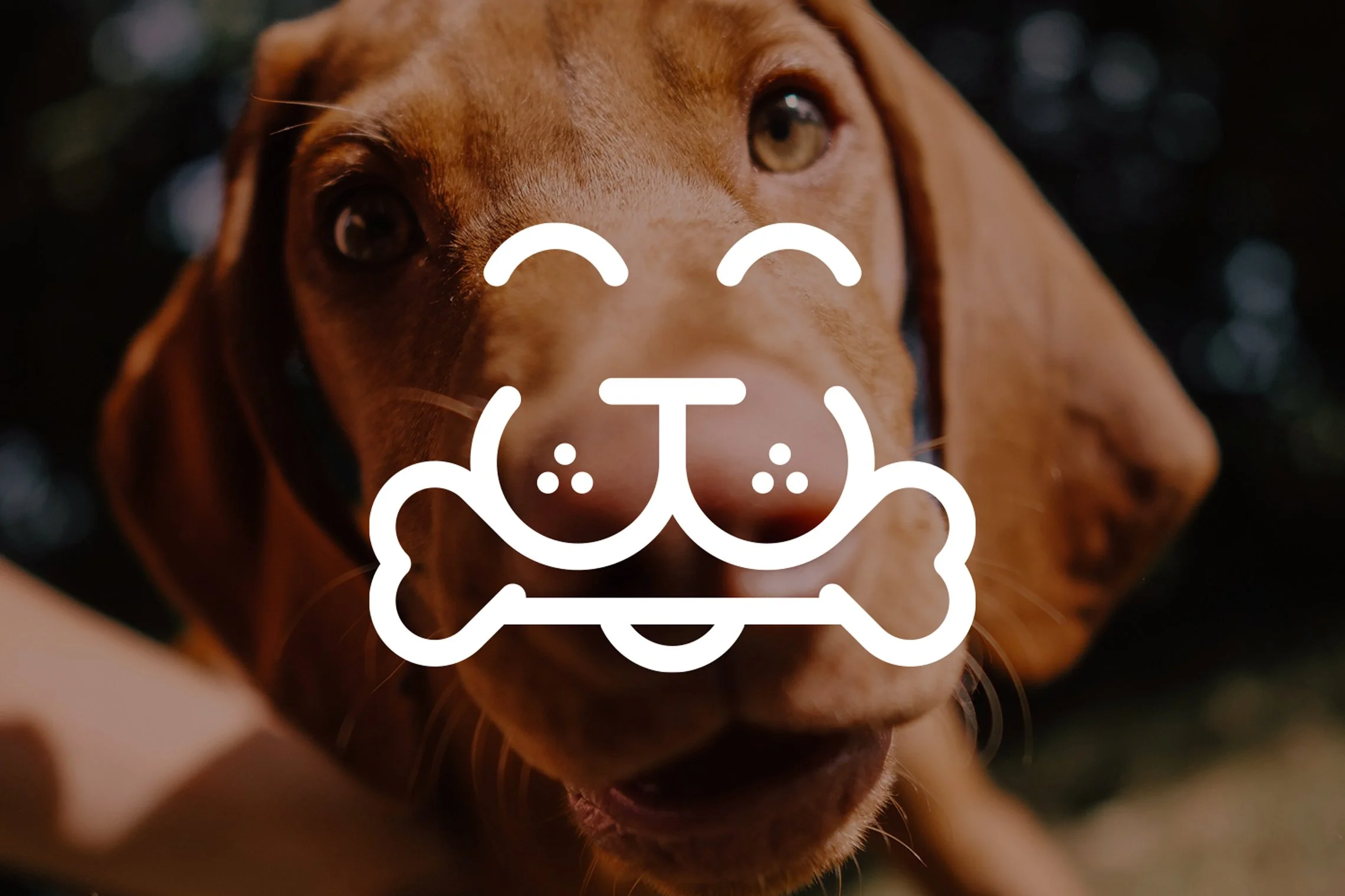
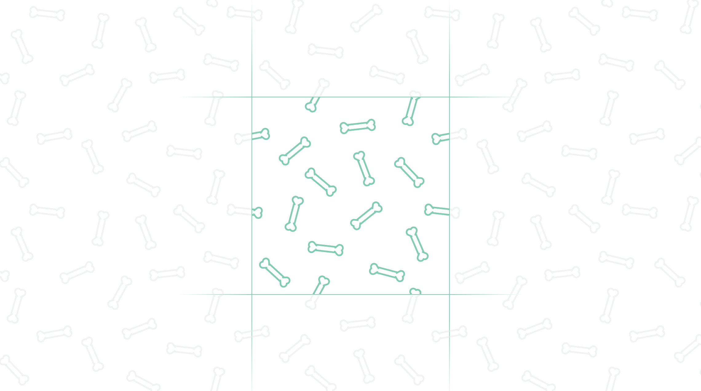
The new identity turns the initials CCT into a happy dog's face. Simple, immediate, and warm. A bone with hearts on each end reinforces the "gesture of love" direction without over-explaining it. The packaging system was built to scale across six flagship flavours and beyond, working as a family on shelf while giving each flavour its own moment. A tongue-like colour element adds energy to the clean white packaging and guides the eye toward fun flavour illustrations. The bone pattern wraps from front to back, where the brand story lives.
The result is a brand that conveys its story and values while looking as good as it tastes (for dogs!).
This project is featured on:


“Working with Brett has been an amazing experience. We started off as a local business (attending farmers markets and small shows) and found it difficult to introduce our products outside of the community. Brett helped us to create a visual identity and new packaging that helped convey our values and story in a much simpler way for new customers to understand. We are now confident that these changes will help us become much more competitive in the retail space and at large trade shows!”