


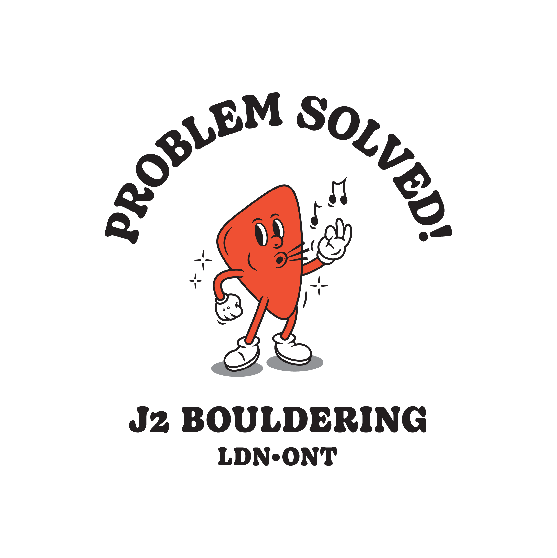
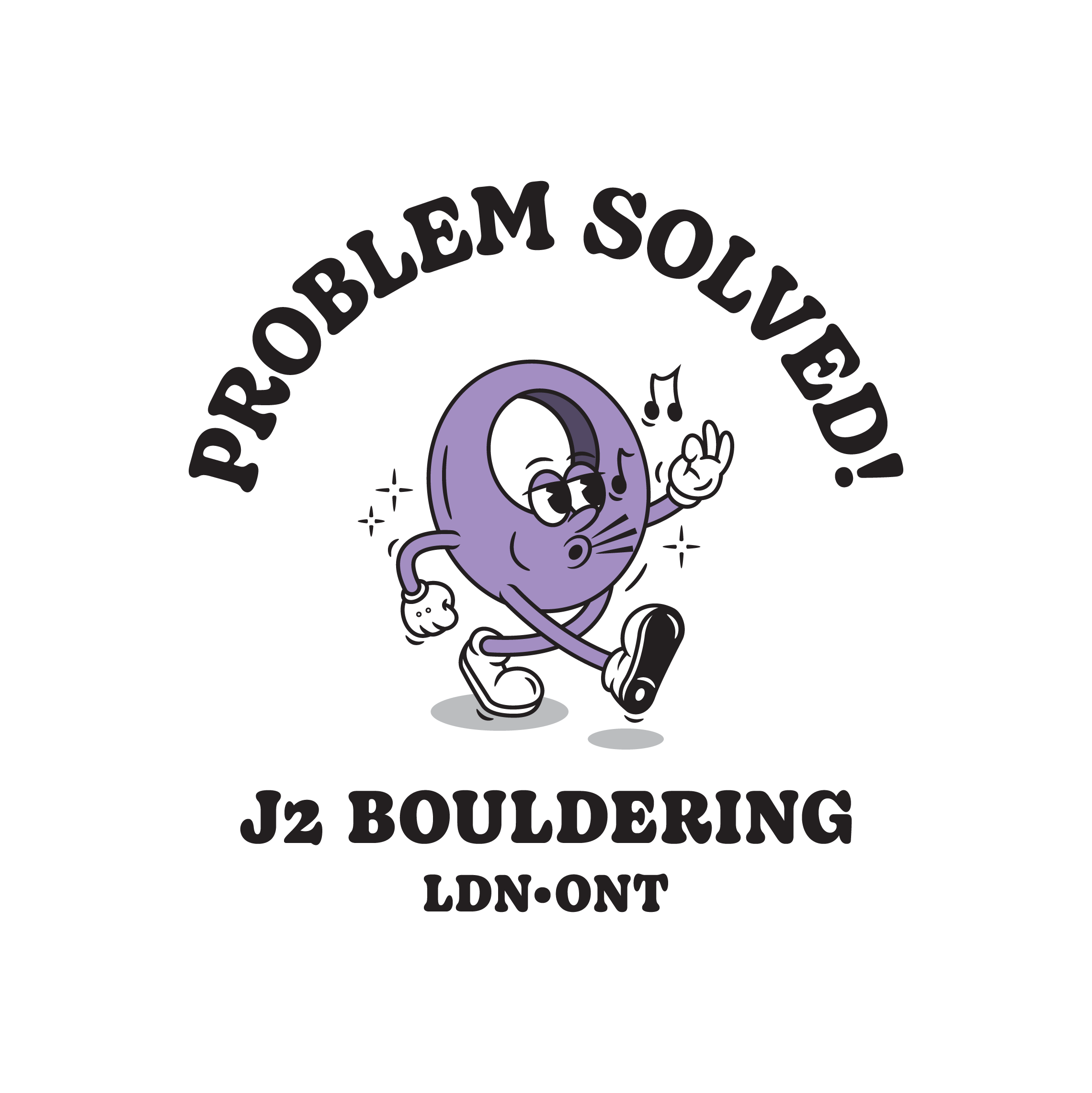
Merch Design

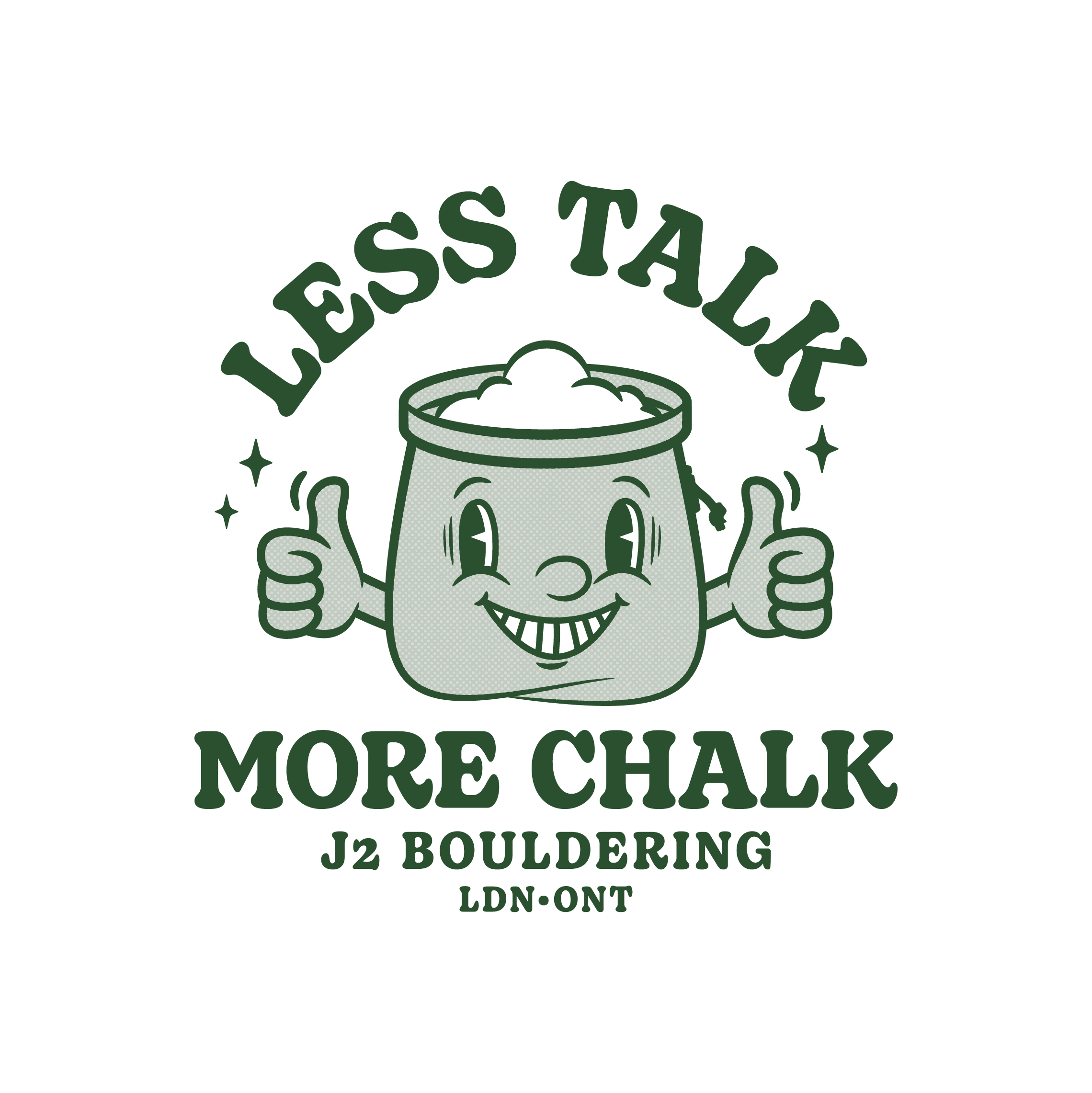
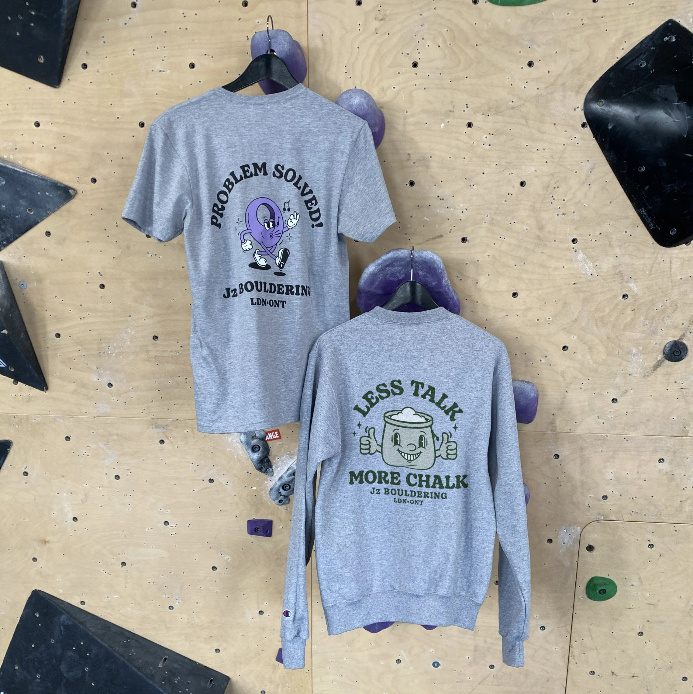
UBS Competition Shirt
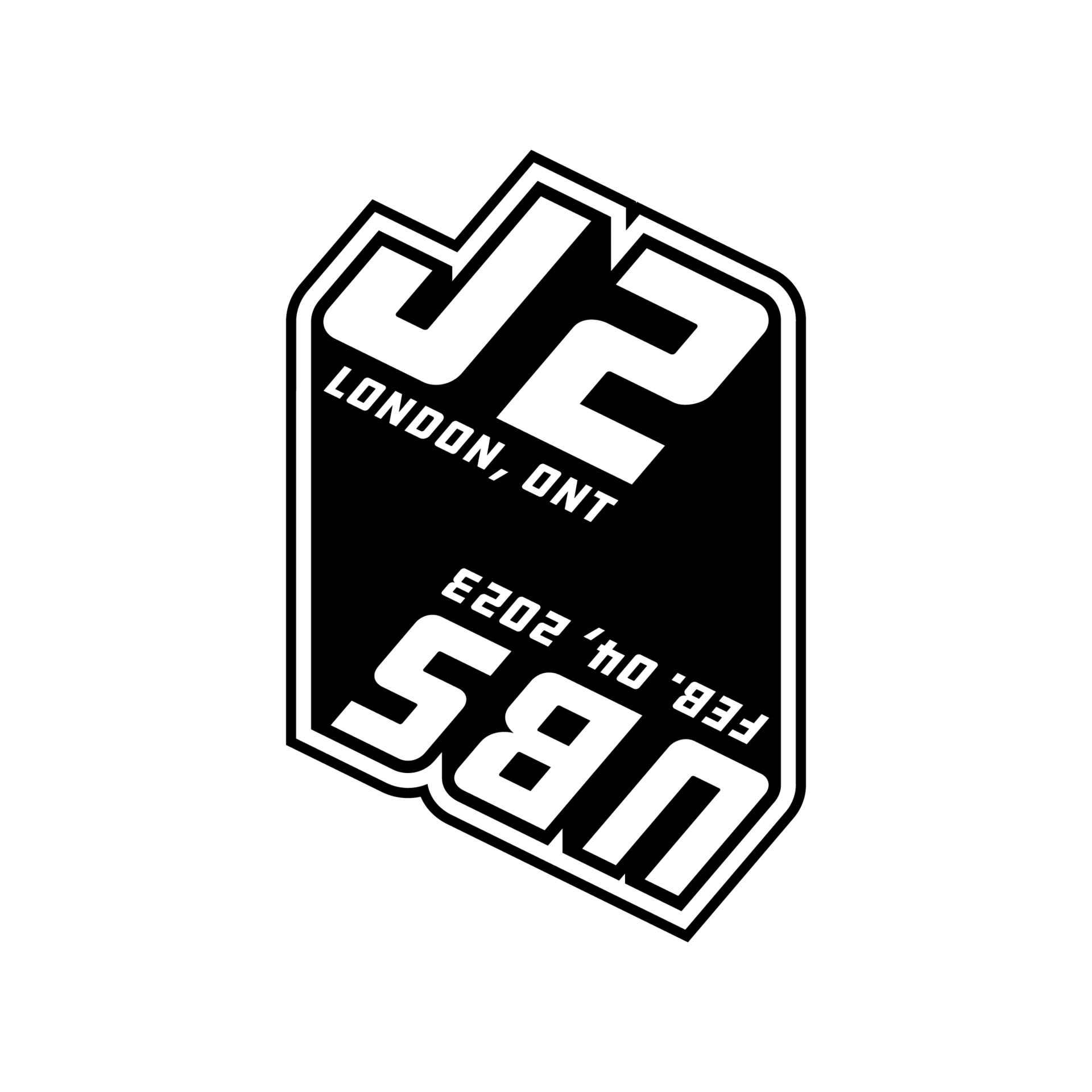

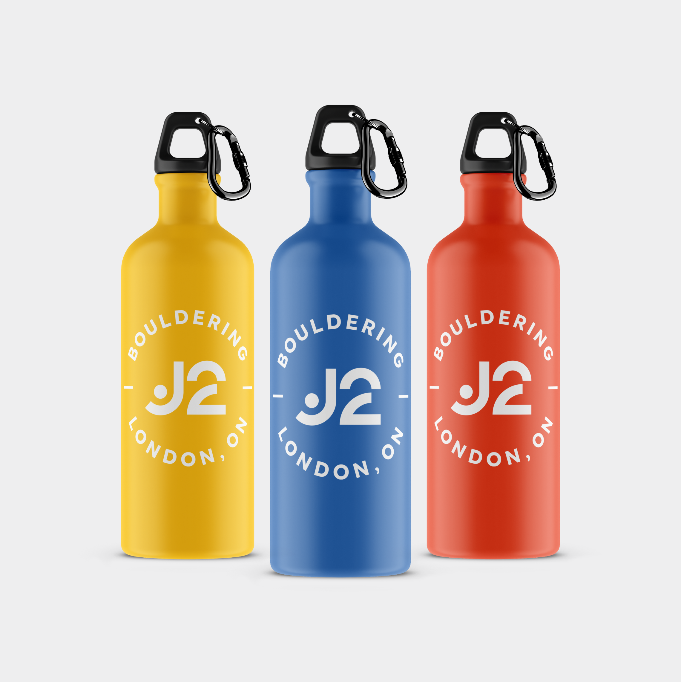
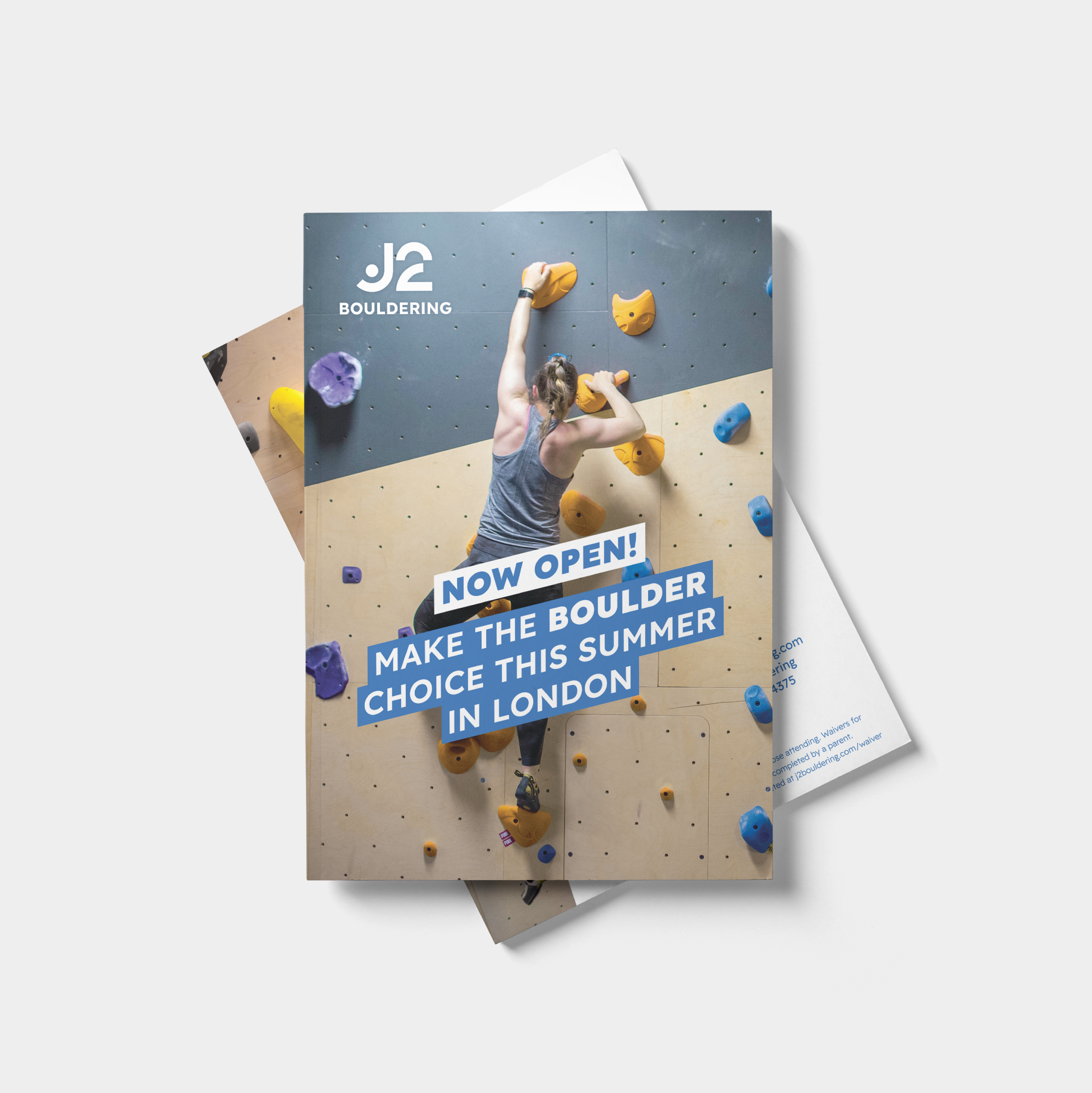
J2 Bouldering
Creating a bold, ownable identity for a new kind of climbing experience
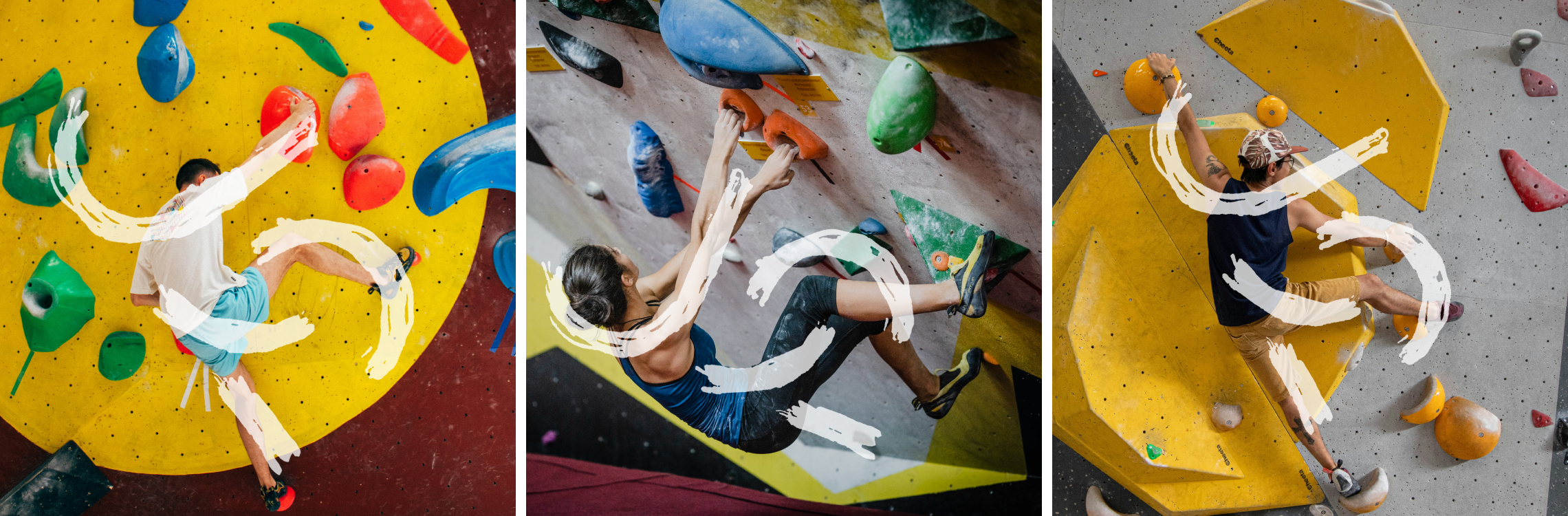
Junction Climbing had the data showing the demand for a new venture. Bouldering was outpacing the available space at their existing climbing gym. J2 Bouldering would be London's first dedicated bouldering gym and Junction's second location. Strategy showed that the brand needed to signal that London could hold its own against comparable gyms in larger cities, and speak to the solo, self-competing nature of the sport.
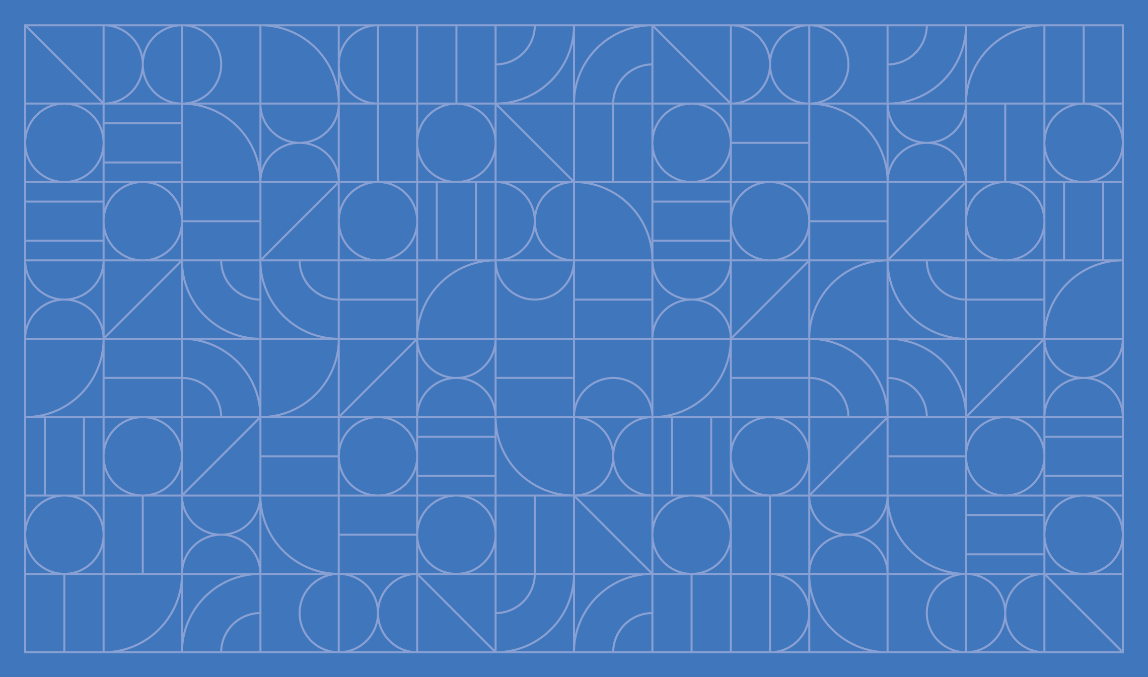
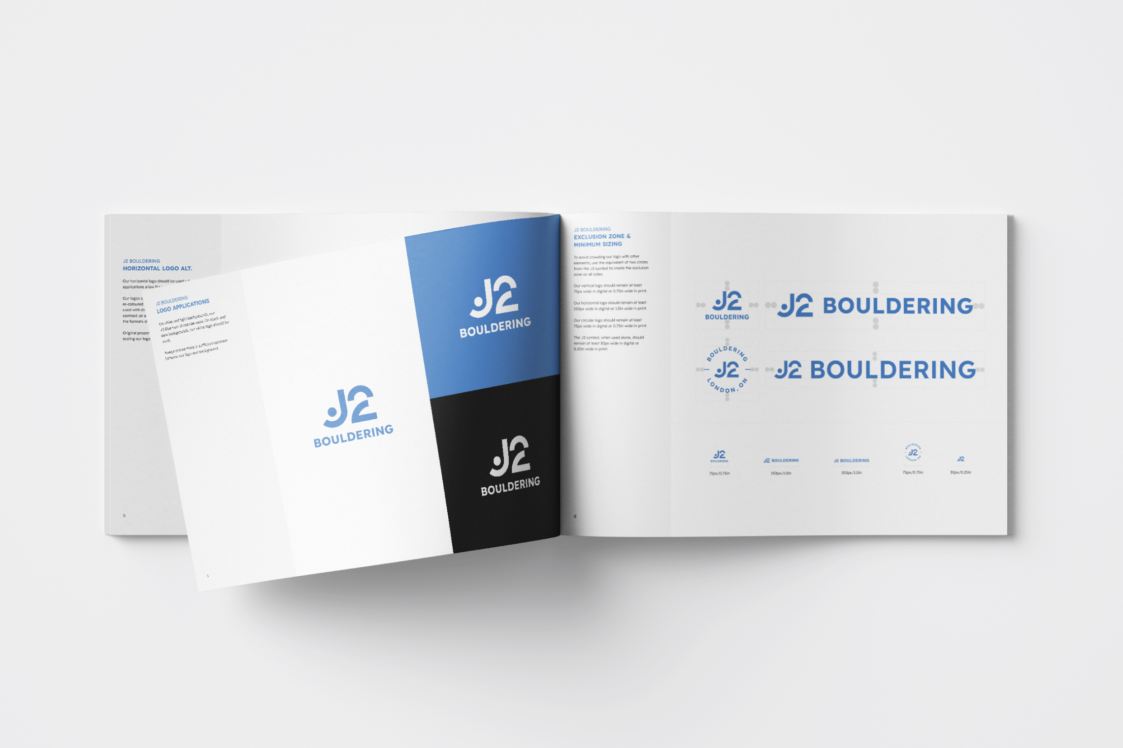
The identity does something most climbing gym logos don’t, it ditches the predictable polygonal wall aesthetic entirely. The "J2" letterforms, with a bit of abstraction, become a figure reaching for a hold, arm extended, leg stretched up. Not immediately recognizable, but unforgettable once you spot it. The vibrant palette was carried over from Junction Climbing to build consistency across both locations, while custom typography and a geometric pattern system round out a brand that feels distinct, energetic, and completely ownable in the space.