


Naming, branding, and packaging for a coffee brand that makes quality feel approachable
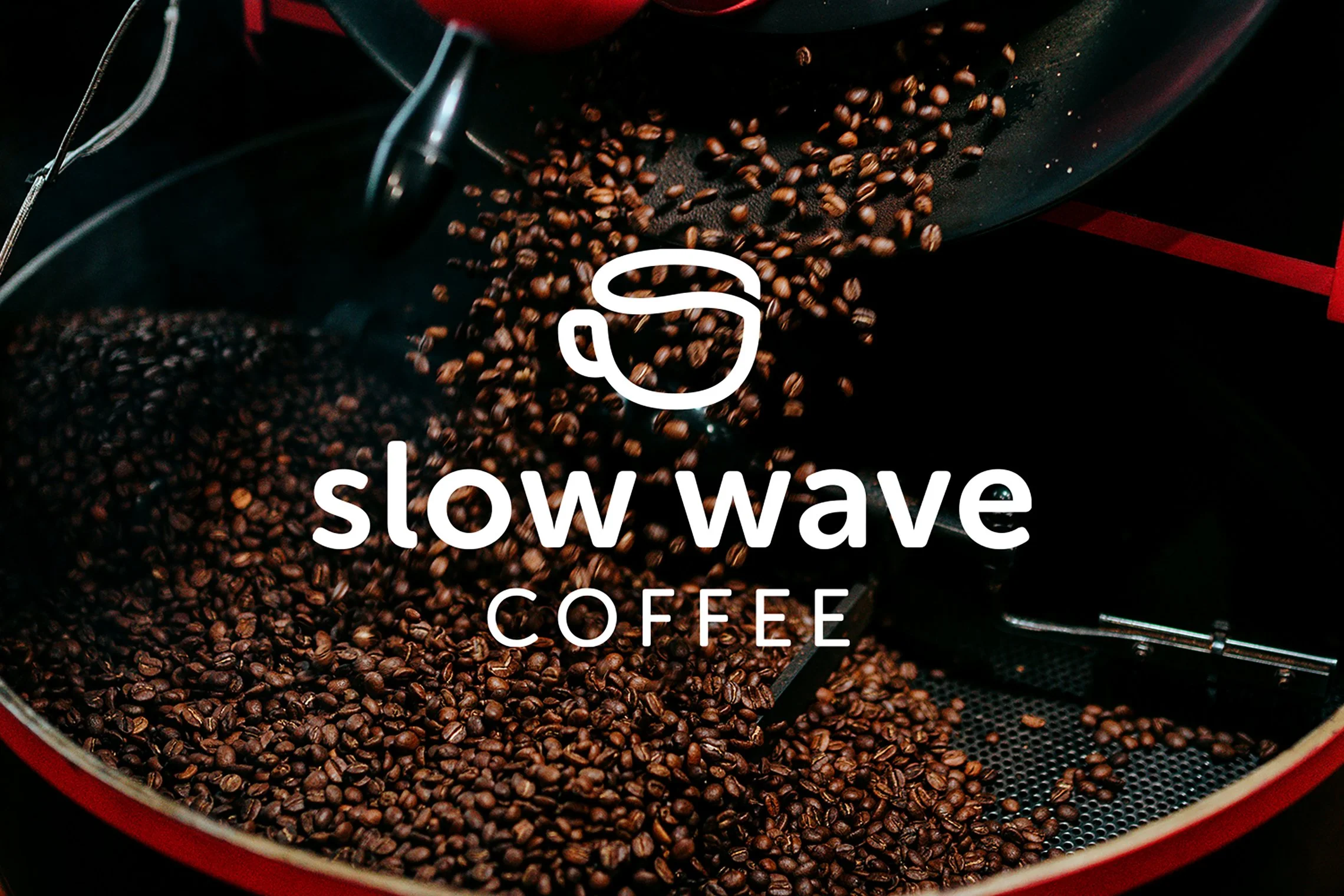
Slow Wave Coffee
The team behind Slow Wave approached me to help guide their new, unnamed brand. Strategy determined that their brand was for people who want to enjoy great coffee without the intimidation of Third Wave culture. They needed a name, a brand identity, and a packaging system that could make their high-quality coffee feel genuinely accessible.
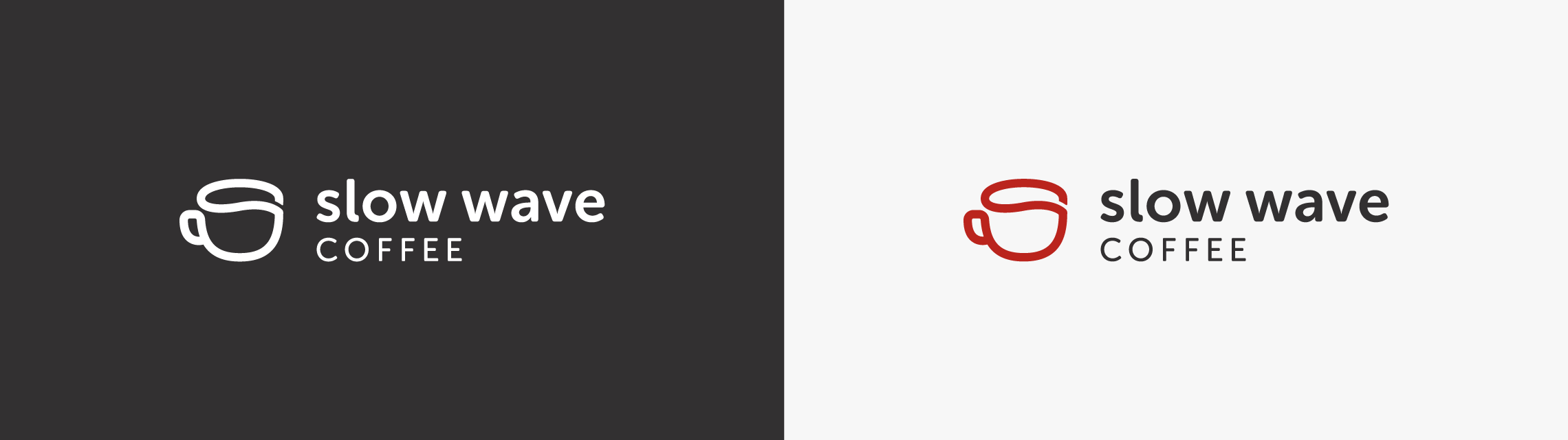
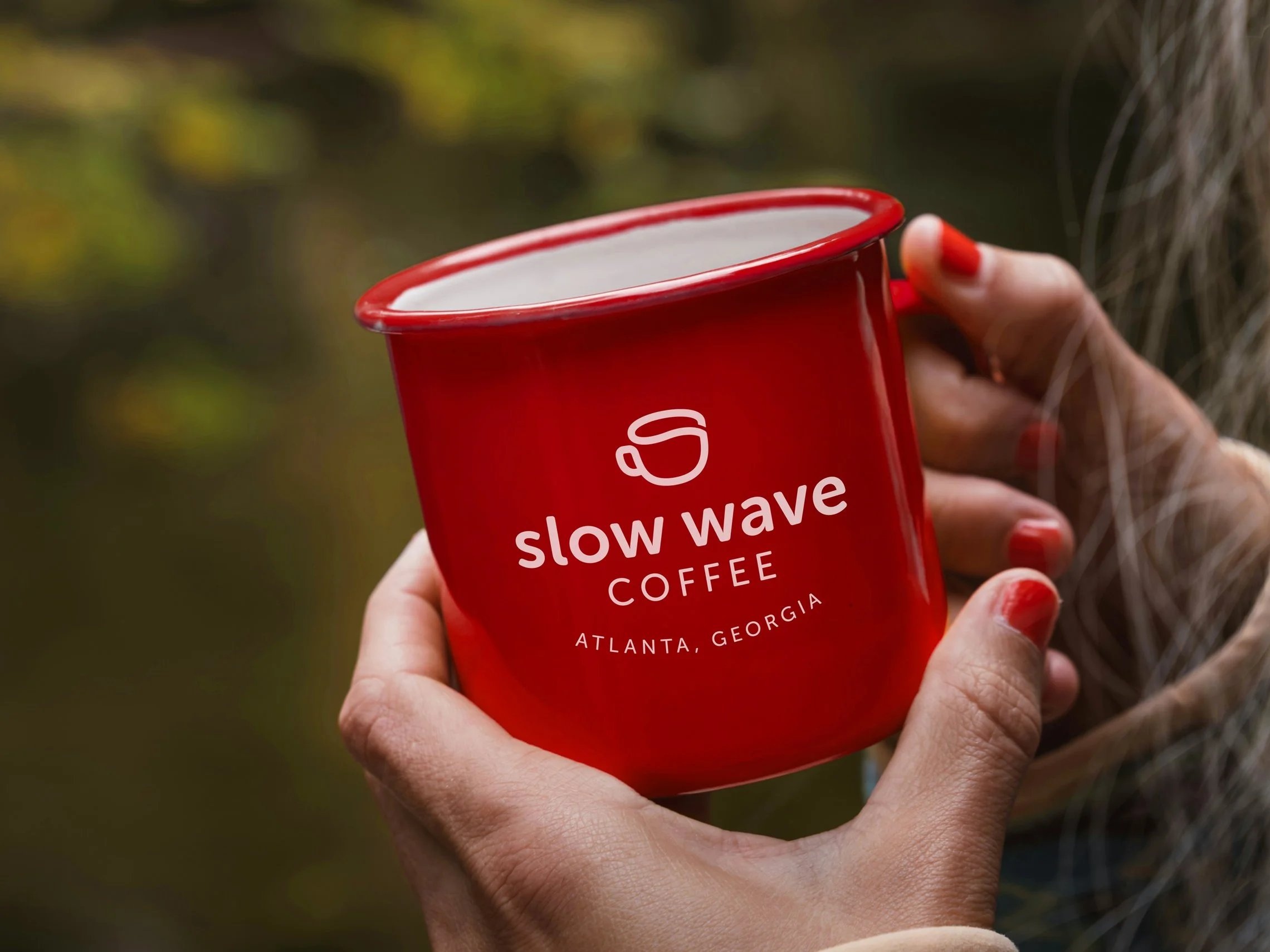
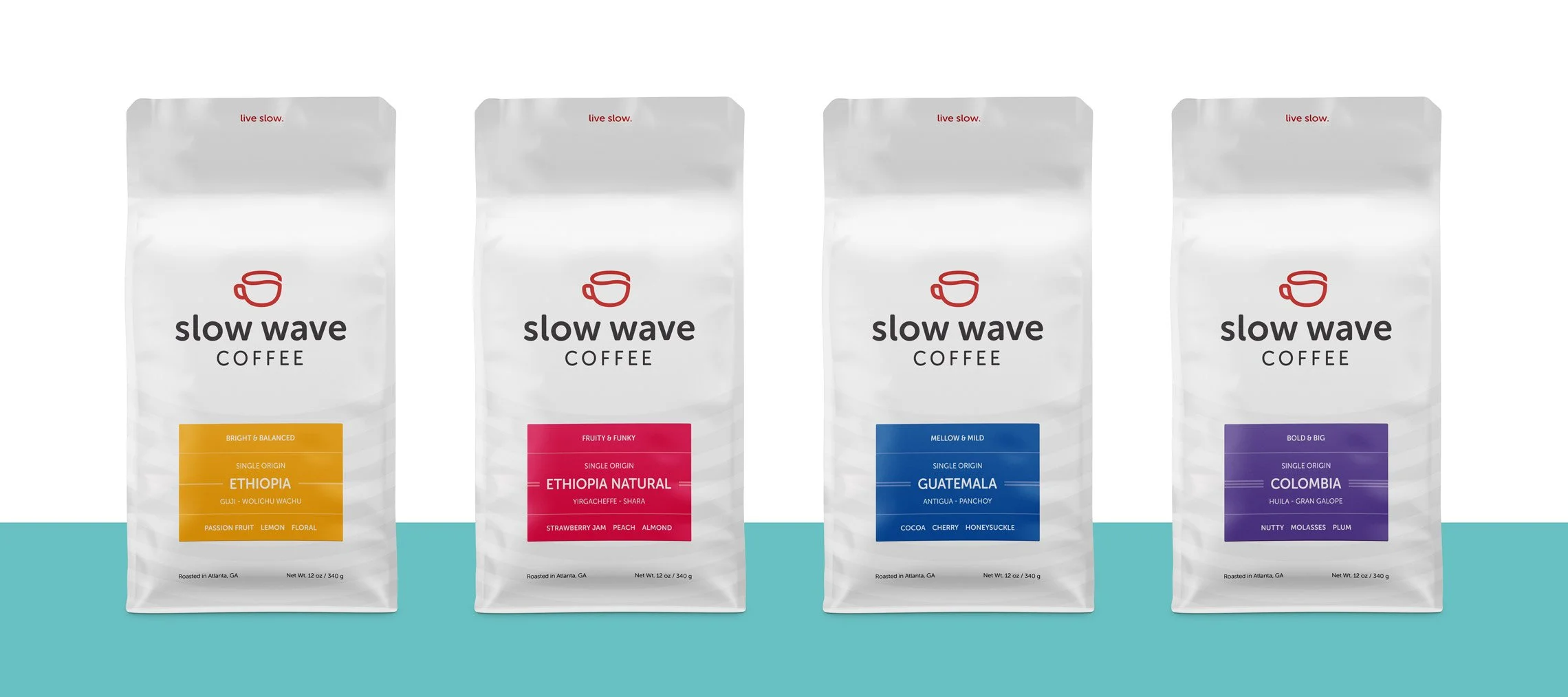
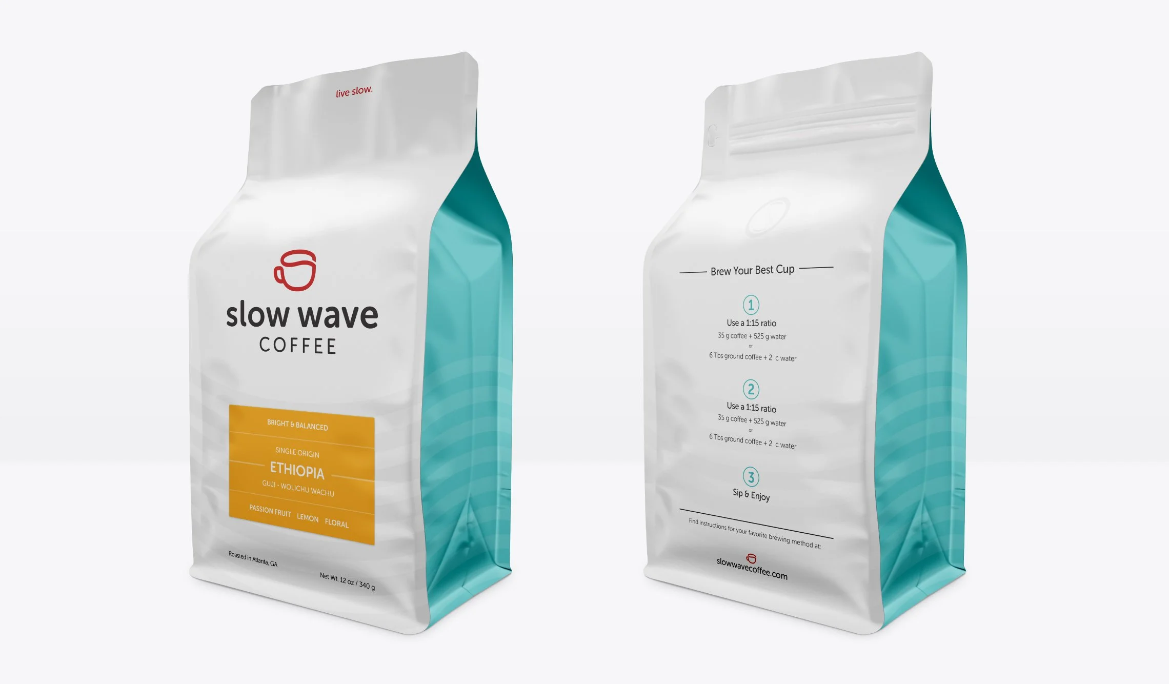
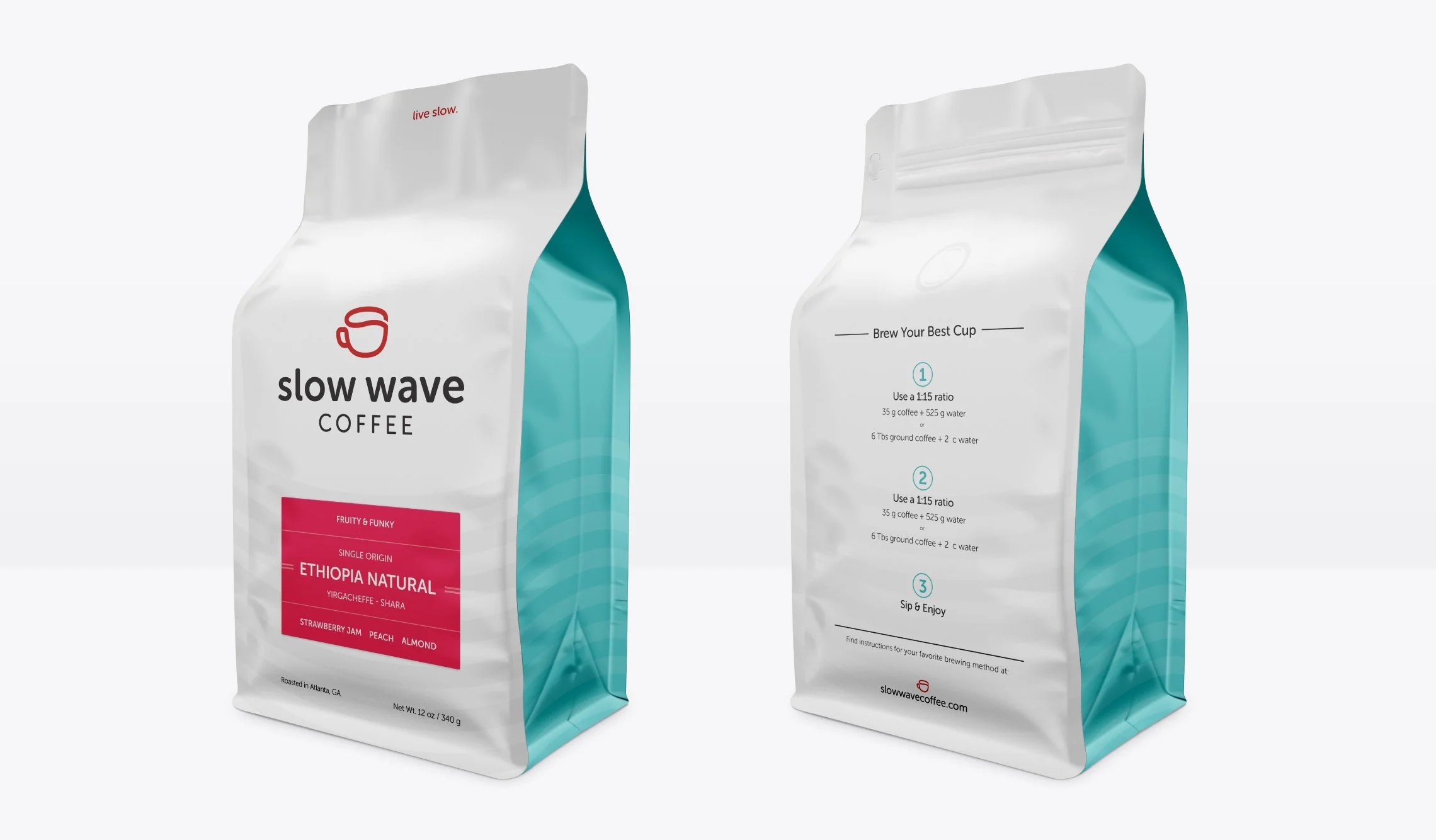
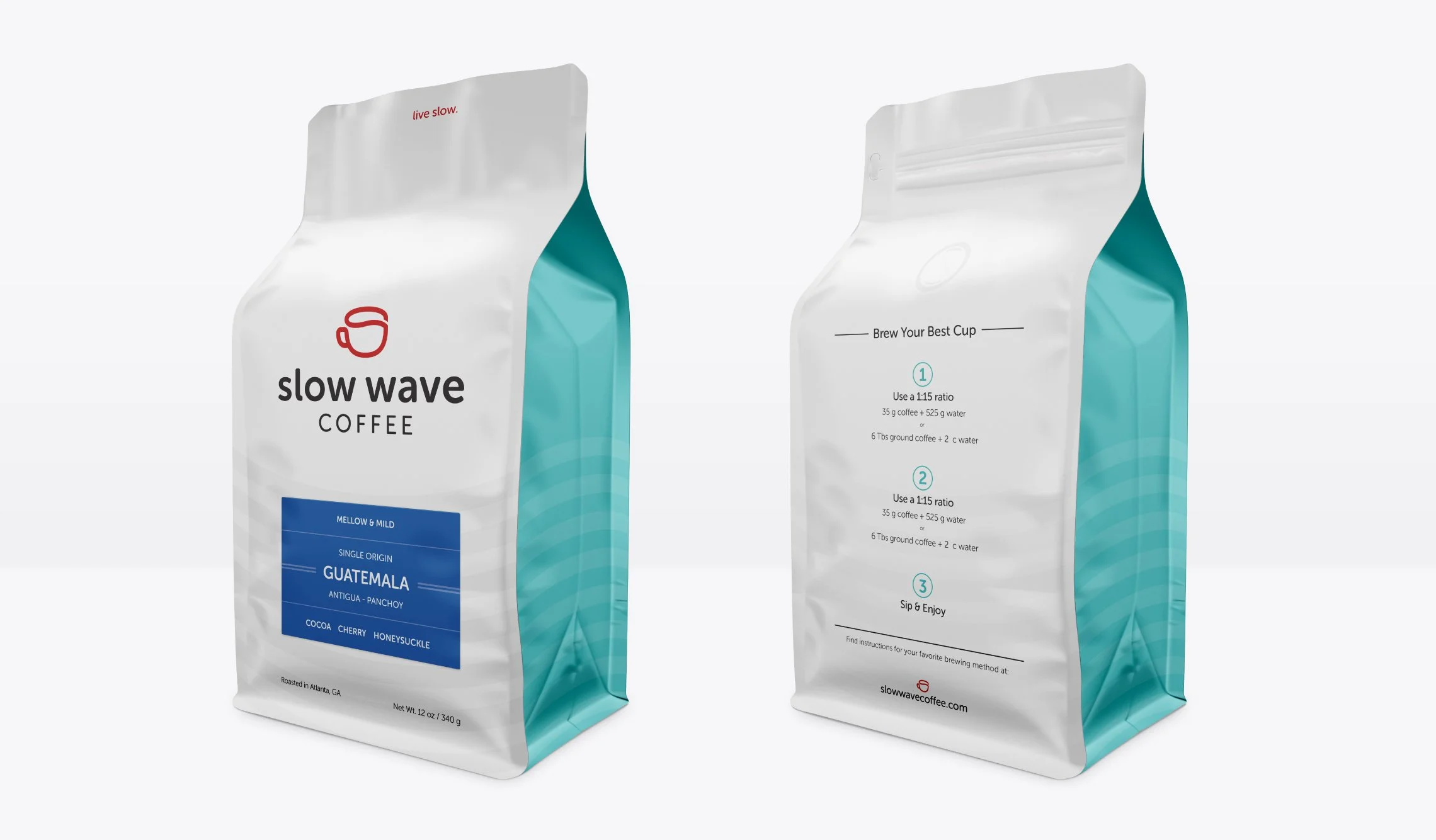
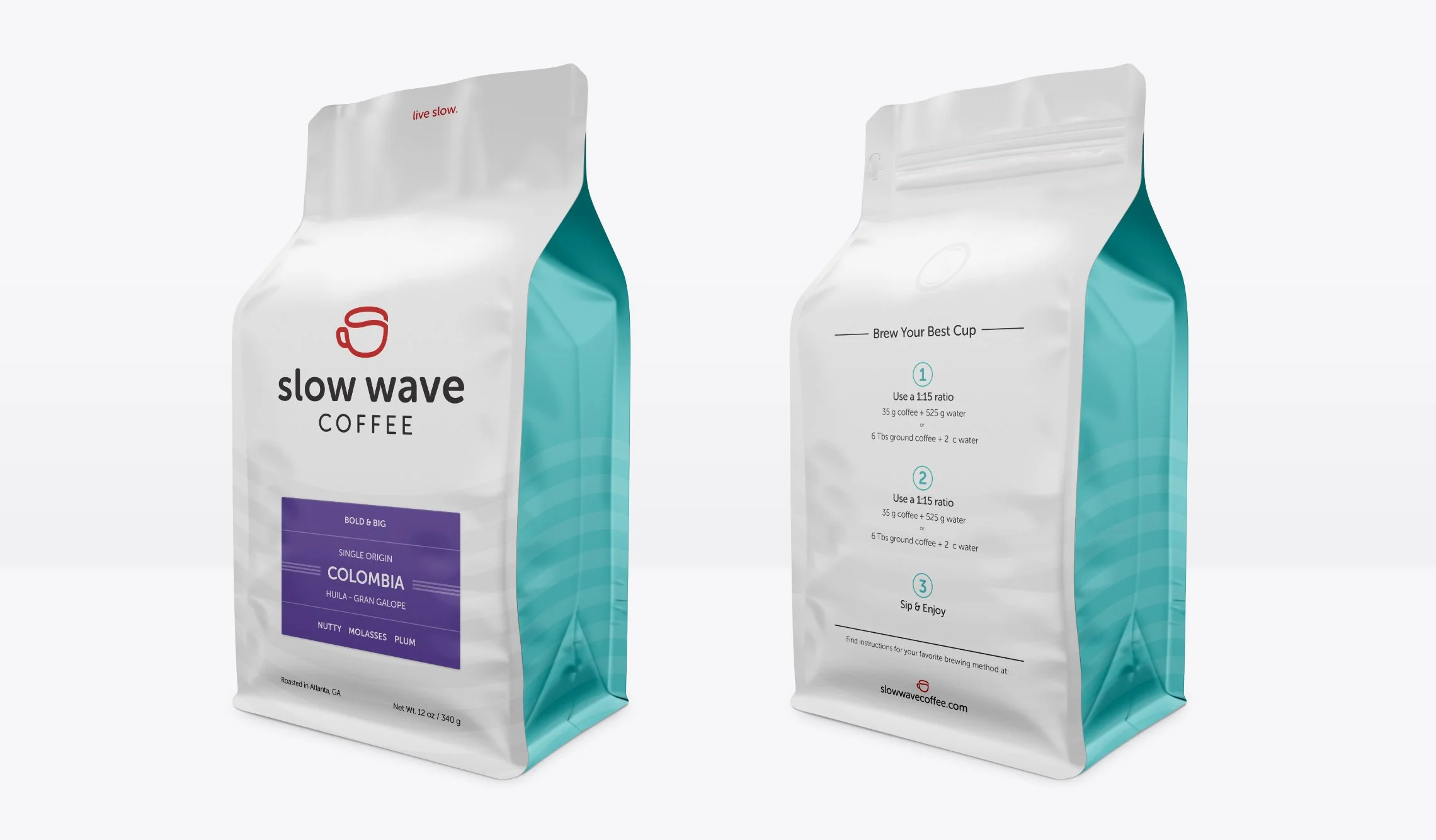
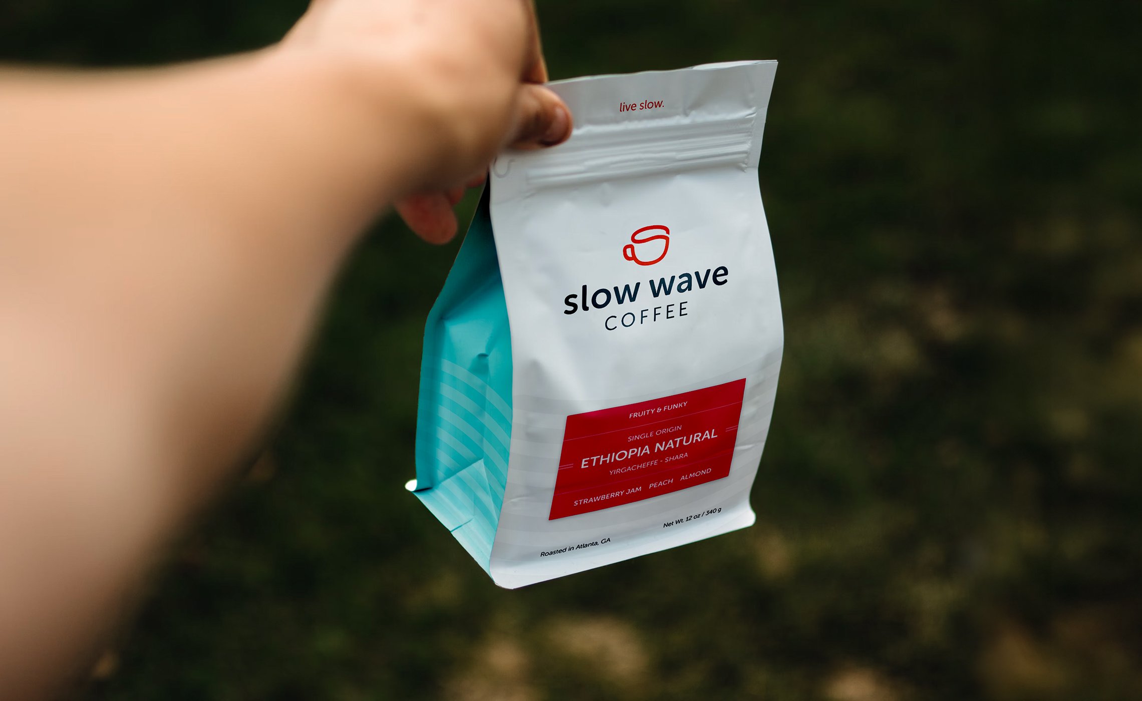
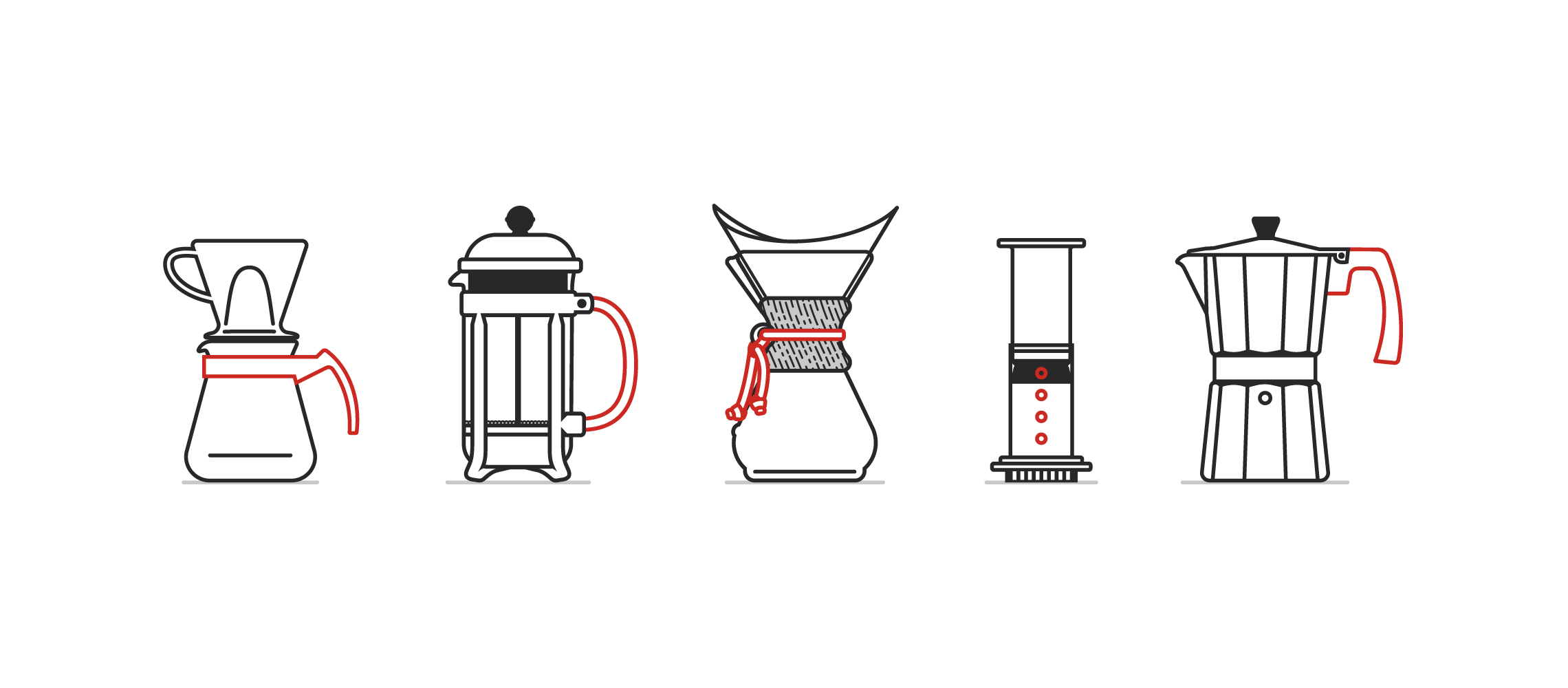
”Waves" are a reference point defining eras in coffee culture, and Slow Wave positions itself as the movement of slowing down and actually enjoying what you've made, not just rushing out the door with a thermos. The identity takes the same approach to design. No artisanal, hand-crafted $12 drip coffee vibes. Just a clean, friendly system built to last. The cup icon doubles as a stylized "S" and anchors a brand that feels warm without trying too hard. On the packaging, four distinct roast profiles take the guesswork out of choosing a coffee, with colourful labels grabbing your attention on the clean white pouches with subtle details. Brew instructions on the back make the packaging useful, not just decorative. The result is a brand that works for both a first-time coffee buyer and a Third Wave connoisseur.
“We could not imagine working with a better designer than Brett. His process was professional and communication was excellent. We were struck by the subtle, clever details of his designs and his keen ability to translate our feedback to improving each round. We are so proud of our brand identity and would recommend his services without hesitation.”